Heatmaps provide visual representations of user behavior, but interpreting them requires caution. That red spot where everyone’s clicking might indicate a broken button, not genuine interest. Content everyone’s scrolling past might have loaded too slowly rather than being uninteresting.
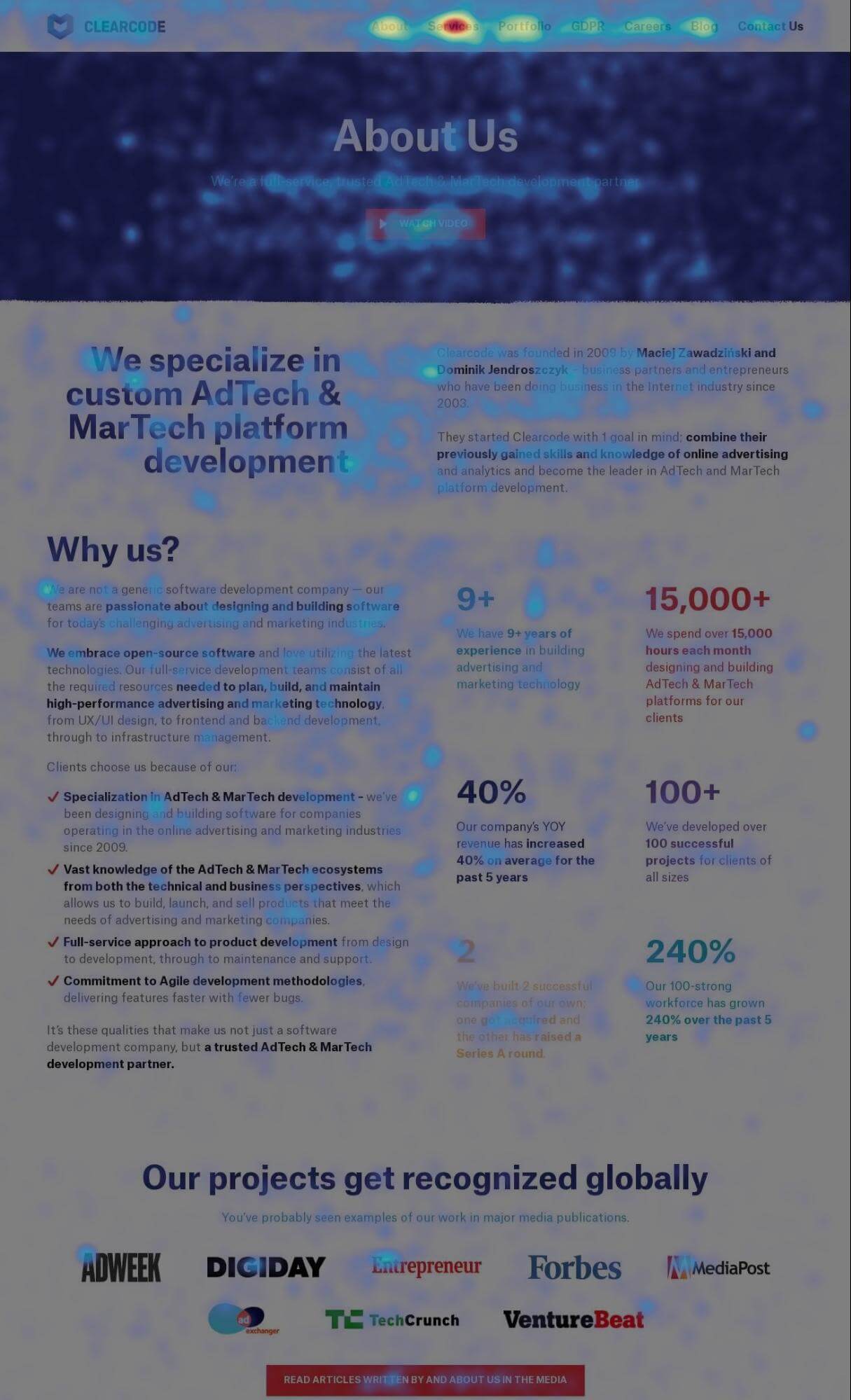
A heatmap is a graphical representation of data that uses color coding to represent different values. In analytics, heatmaps most commonly show user behavior on web pages and mobile apps through visual representations of where users click, how far they scroll, and what they interact with.
Heatmaps use color codes to visually represent how users interact with a website. The color scale typically ranges from blue (least interaction) to red (most interaction), making it easy to see patterns at a glance.
What heatmaps reveal (and conceal)
Heatmaps allow you to assess which website elements users click on and scroll through, and which ones they ignore. This can reveal usability problems, identify dead zones on your pages, and show whether users are even seeing your calls-to-action before they leave.
However, heatmaps don’t tell you why. They show that users clicked something 500 times, but not whether those clicks achieved what users wanted. They show users scrolled 80% down the page, but not whether they were engaged or frantically hunting for information that should have been higher up.
Different heatmap types serve different purposes
Click heatmaps show where users click or tap. Use these to identify whether users are clicking non-clickable elements (suggesting they expect them to be interactive) or ignoring your actual buttons and links.
Scroll heatmaps show how far down the page users scroll. Use these to determine where to place critical content and CTAs, or to identify content that could be moved higher or removed entirely.
Move heatmaps (mouse tracking) show cursor movement patterns. These are less reliable on desktop – many users don’t move their mouse while reading – but can indicate points of hesitation or confusion.
Common interpretation mistakes
Looking at too few sessions to draw meaningful conclusions will lead you astray. Device differences matter – mobile versus desktop behavior is dramatically different. Treating correlation as causation without supporting data from other analytics creates false confidence in your conclusions.
Read more on heatmaps in our help center: Piwik PRO site inspector for Chrome
Here is an example of a heatmap: