A heatmap is a graphical representation of data that uses a system of color coding to represent different values. Heatmaps are used in various forms of analytics but are most commonly show user behavior on web pages and mobile apps.

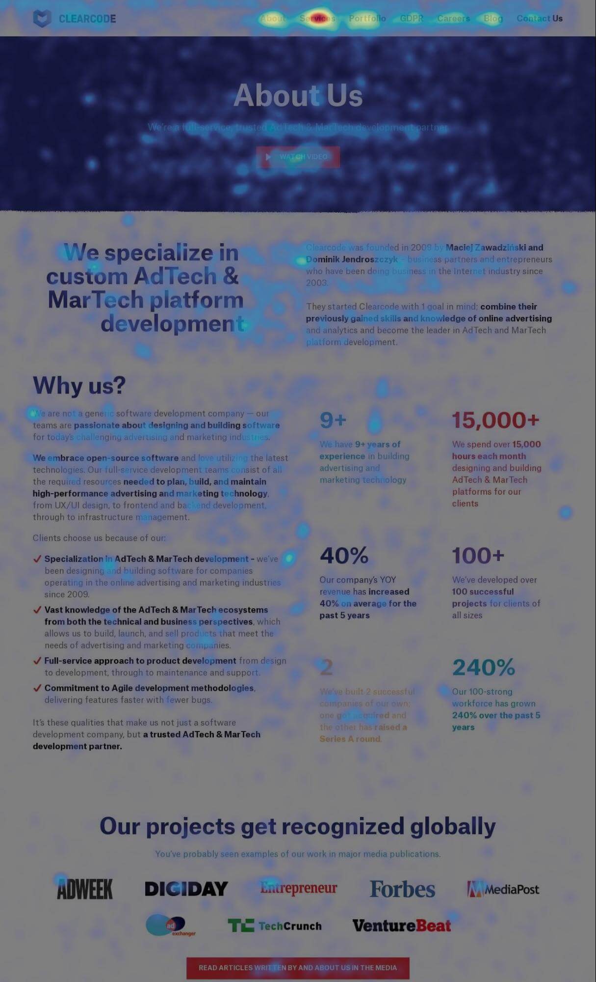
A heatmap uses color codes to visually represent how a user interacts with a website. The color scale ranges from blue (least interaction) to red (most interaction).

Heatmaps allow you to assess which website elements users click on and scroll through and which ones they ignore.

Read more on heatmaps in our help center: Piwik PRO site inspector for Chrome

Here is an example of a heatmap:

  • Piwik PRO expands global hosting options with new data center in the UAE

    Piwik PRO remains committed to delivering flexible, secure, and regionally focused hosting solutions for businesses around the world. We’re pleased to announce the launch of our new data center in the UAE North, hosted on Microsoft Azure. This latest addition complements our existing location in Hong Kong, expanding our global hosting footprint and offering organizations…

  • HIPAA-compliant analytics in 2025: Your complete vendor comparison and selection guide

    Vendors have been adjusting to the shifting landscape of privacy-oriented analytics and their clients’ expectations. Many of them change their offers accordingly. At the same time, the dominant analytics vendors are not necessarily the most compliant options for healthcare providers. The stakes have never been higher, with U.S. healthcare firms paying over $100 million in…