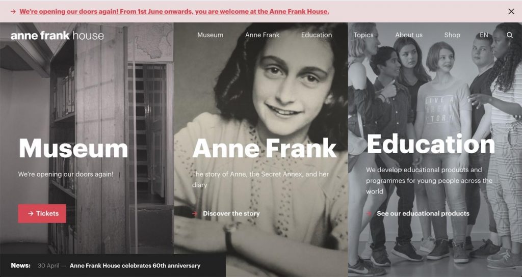
The Anne Frank House is a museum dedicated to the wartime diarist Anne Frank. It’s one of the top ten museums in the Netherlands. Yearly, more than one million people visit The Anne Frank House, commemorating Anne Frank and preserving her legacy.
The museum has three main objectives:
- To preserve Anne Frank’s former hiding place and open it to as many visitors as possible
- To teach a worldwide audience about her life and the historical context of the Holocaust and the Second World War
- To educate people about the dangers of intolerance and the importance of democracy and civil rights
The Anne Frank House also publishes books, organizes trainings and seminars and creates digital and printed educational materials.

The digital challenges facing a modern museum
The website is an important communication tool for the museum. Its main goals are:
- Selling museum tickets and giving information about visiting the museum
- Telling the history of Anne Frank in an engaging and accessible way
- Providing educational products and services
- Being fully accessible on all devices
Most of all, the Anne Frank House wants to engage their online visitors and encourage them to not only buy a ticket, but also get information about Anne Frank’s life.
Museum staff redesigned the website and wanted to see, with data, if they met these goals. They also wanted to know how online visitors interacted with the website and what sections they visited. The staff asked themselves: “Are there differences in session duration or the amount of page views per section or during the cross-section visits?”
The museum staff made every effort to provide their visitors with materials that were helpful and relevant to each visitor’s interests. Making the ticket section more user-friendly was also on the to-do list, so everyone buying tickets online could do it quickly and efficiently.
The analytics software that the museum used was going to be discontinued and they had to find an alternative.
Piwik PRO Analytics Suite is a kind of monitor, showing us if things work how we want them to work. For us it‘s especially important to see which sections of the museum’s website people visit – this gives us an overview of visitor behavior and with this information we know what to work on to support the museum’s educational role.
Gerrit Netten
Project Manager Digital Projects at Anne Frank House
Looking for web analytics to support the museum’s mission
The Anne Frank House tested another tool out before making the final decision, but they weren’t happy with it. Piwik PRO was easier to work with, especially for the staff with less experience in reading dashboards and charts. The fact that the other tool wasn’t GDPR-compliant was an additional problem, as the museum wanted to comply with the new EU regulations.
With the amount of traffic the museum had, they also had to keep in mind the price factor. Piwik PRO’s flexible pricing tiers were a good fit. What sealed the deal was that the data wouldn’t be sampled and the museum had full control and ownership over the data they would collect.
The implementation was done within five days. Piwik PRO’s solution architect configured the Analytics and Tag Manager modules and consulted the Anne Frank House on setting up tracking and choosing the right metrics.
Tangible results across devices, page sections and languages
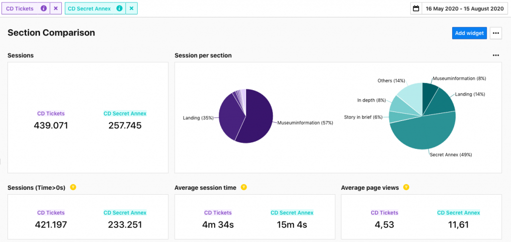
Thanks to Piwik PRO, they could divide all the pages into segments corresponding with the sections they have on the website. That allowed them to learn more about how visitors, both individuals and groups, flowed through their website and to identify the differences between sections. Based on the data, it turned out that the most popular sections are Tickets and the one about Anne Frank’s life, but they were not visited at the same time.

Better responding to visitors’ interests
Learning more about visitor behavior patterns was a priority for the museum. Using Piwik PRO they discovered two main types of visitors on their website.
One group spent a lot of time reading the informative sections (e.g. Secret Annex). This trend intensified during the COVID-19 outbreak, when the museum was closed – those who would buy tickets and visit the museum were instead visiting the Secret Annex online and reading other online materials.
Offering interesting materials was rooted in the museum’s mission. That’s why it created a series of videos about Anne Frank and other topics, following up with an analysis of how many people watched the videos. Data from Piwik PRO showed that interest was lower than expected, so staff allocated their time and efforts to other educational projects.
Making the site accessible to speakers of different languages
The museum’s website has 4 different language versions. Each page on their website has several URLs, different ones for each language. Thanks to advanced tracking and the addition of meta tags to the pages, the museum can identify who their visitors are – what country they come from and which language version they use for each page.
Based on this, the museum can decide if the language version set is right, if they need to add another or remove one that’s rarely used. Every change is costly, but thanks to data from analytics they can allocate their budget without guesswork.
Improving the ticket-buying experience
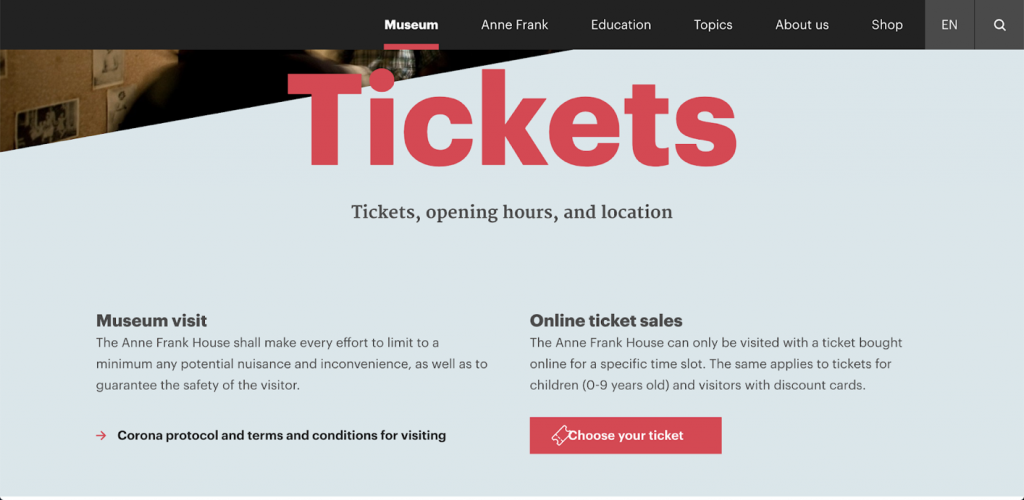
The ticket section is the second most important part of the website. Staff found out that online visitors were buying only one type of ticket, despite other options being available. To make the ticket section clear and better show all the possible options, the museum decided to rearrange the ticket section.

They added a new page presenting all the ticket options, titled Choose a ticket instead of Buy a ticket. From this point the visitors knew that there were different ticket types and they could choose the one that fit their needs. In just three days, visits to the English version of the shop in the ticket+ section increased from 230 to 2388 and to the Dutch one from 38 to 170. This significantly increased the ticket+ sales.

Improving responsiveness across devices
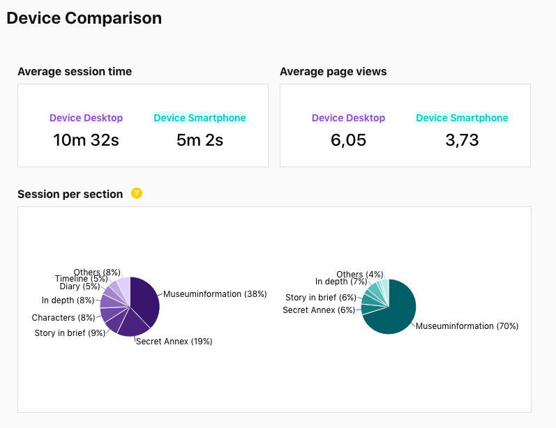
One of the museum’s goals is accessibility on all devices – they want the website to be fully responsive. By comparing device use, it soon became clear that some sections were mostly viewed on desktop.

This dashboard compares the sessions of desktop (purple) and smartphone (green) users. The museum information section is most often viewed on smartphones, while the Anne Frank section is most often viewed on a desktop computer. These are important insights that they use when designing new features.
Summary
The Anne Frank House educates people all over the world about Anne Frank, helping preserve her legacy. The museum uses Piwik PRO Analytics Suite to improve that experience, making their website more accessible and attractive to a wider audience.
The Anne Frank House appreciates that Piwik PRO Analytics Suite provides reliable data in a flexible and privacy-compliant manner. The museum owns 100% of the data, which it collects and stores in Europe. They can also reach out to their Piwik PRO representative at any time with advanced technical requests.

Industry:
Museums & Institutions
Locations:
The Netherlands
Highlights
- 1000% increase in tickets+ page visits, which increased ticket+ sales
- Keeping visitors engaged with content matching their interests
- Better allocating the budget based on thorough analysis of reliable, unsampled data
Download this success story as a PDF
So you can read it later or share with a friend.


