Exit intent pop-ups: friend or foe? There’s no straightforward answer, as everything depends on your strategy. These small message windows generate controversy for their negative impact on user experience. That said, their ubiquitous presence in the digital world implies that they do provide us with real benefits, namely conversion optimization.
The truth is, more and more e-commerce sites are employing exit intent pop-ups to turn visitors into buyers and improve conversion rates. How do they do that? They must be relevant, clear, and give visitors reasons to stay on your site. According to statistics by Beekiting, you can save up to 35% of lost visitors by providing them with exit intent offers. That’s a good number, and definitely enough reason to give them a go.
In this post we’ll show you the wider context of the entire concept behind this lead generation strategy. You will also find some relevant use cases you can easily implement. We’ll prove that these pop-ups can be a real game changer.
1. The inner workings of exit intent pop-ups
Let’s start with some theory on the exit intent technology that propels pop-ups. The technology applies tracking algorithms to detect the user’s movements as they interact with your site. It could be a mouse cursor movement towards an exit option, a address bar, a new tab, or simply a close button. When the visitor’s actions match these algorithms, the technology triggers a dialog box on the user’s screen with a tailored message to make them stick around at your site.
In other words, these algorithms can predict when a visitor intends to leave your site. This gives you a second chance to engage visitors and prevent them from abandoning their cart and leaving your site. The ultimate objective, of course, is to convert them.
Free Ebook: 6 Steps to Start Capturing Customer Journey in e-Banking and m-Banking
Learn how to improve customer experience and UI of the e-Banking and m-Banking platforms
The more complex exit intent platforms offer more precise methods to predict user actions. They analyze the user’s behavior on previous pages and the movement across the whole site, not just the top or movement away from the window. In addition, such algorithms can spot resting movements or particular mouse pathways.
That’s a significant advantage as the user may move the cursor to the top of the page for various reasons, not just because they intend to leave your site. Some reasons could be multitasking, using multiple monitors, or just entering the top of the page by mistake.
2. What you can achieve with exit intent pop-ups
Discussing the benefits of the exit intent technology, we focus primarily on optimized conversion. However, there’s a lot more going on. To get real results, you need to see the smaller pieces of this marketing jigsaw puzzle.
Here are some use cases where exit intent pop-ups work best:
Recover abandoned carts
The e-commerce industry faces a tough challenge of high rates of cart abandonment. Even though you go to great lengths and spend large sums on PPC campaigns, some visitors will leave their carts without making a purchase.
As reported in a survey by the Baymard Institute, 69.23% of online shoppers drop their cart without finalizing the purchase.
Let’s take a closer look at this case and how exit intent pop-ups can come to the rescue.
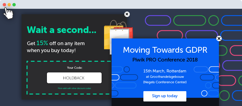
A visitor to your online shop has put some items in their cart, but at the last moment decides to leave your website. They might get distracted or be discouraged by shipping costs. So, as they attempt to close the page they see a pop-up with some engaging incentive. You could offer a 10% discount or free delivery to encourage them to complete the purchase. You can go even farther and give a steeper discount if they complete the transaction today.

Redirect the visitor to other content
It goes without a saying that you design your product page with visitors in mind. Still, no matter how much time and effort your devote to it, users might just up and leave without taking any further steps. This doesn’t mean you’ve lost your chance to convert them. Rather, it means that it’s your turn to act.
Let’s imagine that there’s a company representative who needs on-premises web analytics software and visits the Piwik PRO site for the first time. They’ve just started doing research and have little background knowledge of the issue. As they browse https://piwik.pro/web-analytics/ they decide to exit the site. What can you do? Spark their interest by offering them useful materials with a pop-up suggesting a free download of a Web Analytics Vendors Comparison.

Promote an important event
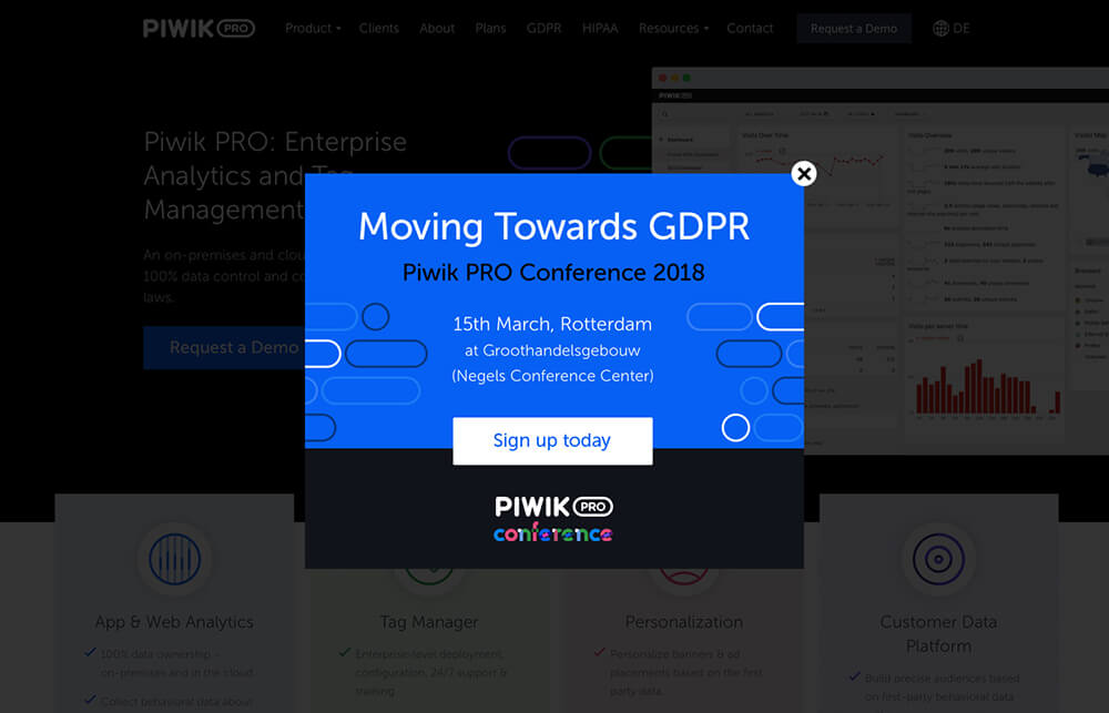
You can do more with exit intent pop-ups than just rescuing conversions. Use them also to advertise your offers and events. Suppose your company is organizing a high-level conference and wants to attract a wide audience. With additional tools like a Personalization module, you can set the trigger to display a pop-up advertising this event to people who haven’t visited the conference’s landing page. This kind of pop-up can go on any site you choose.

Grow your subscribers list
This is a classic use case for exit intent pop-ups. The importance of a good email list for your business is pretty obvious, but expanding it can sometimes be a tricky task. Exit intent technology gives you a chance to grab email addresses by providing an incentive to subscribe. This is one of the most effective methods: data from Optimonk proves you can achieve sign-up rates between 3% and 5%.
Make on-site surveys
You gather data from your visitors in order to understand and meet their expectations, so getting their opinion first-hand is vital. Exit intent pop-ups can be used for on-site surveys, easily reaching your visitors to get their feedback. Optimization consultants and experts stress that this kind of research is crucial for finding process bottlenecks, removing friction, and ultimately improving conversion.
Promote your social media channels
Exit intent pop-ups can support your presence in social media. Create effective messages with social media icons to guide visitors towards your social media sites. This can lead them to like and share your content.
3. Best practices
As you can see, exit intent pop-ups are just the job in many situations. However, without the right strategy and approach, they’ll just be flashy, annoying dialog boxes that drive your visitors away. Here’s a few actionable tips you can try out:
Keep it simple
The strength and effectiveness of exit intent pop-ups lies in their simplicity and timing. The focal point is your message: minimize the amount of text and make it compelling. Both design and language should be simple, just enough to get the message across. The exit intent pop-up is your last resort for keeping your visitor at the site. Don’t overload your pop-up window with images to make people dazed by its content. Finally, your call-to-action should be clean and simple so your visitors know what to do next without any guessing.
Personalize the message
Exit intent pop-ups have earned their bad reputation for aggravating site visitors. One reason is that they tend to be too generic. How to change this negative reception? Apply a personalization strategy and speak to your visitors directly. Use their names, referral sources, and any other information you gather in your database to make the message unique and suitable to their preferences.
Want to improve your personalization strategy and get the most of your data? Think about implementing single customer view. Learn more about this concept here: What is Single Customer View and How Does it Work?
Segment your visitors
Different content appeals to different visitors. To make your exit intent pop-ups relevant to your visitors, the key is to know them and deliver content that resonates with their needs, preferences and expectations. For example, you don’t want to irritate subscribers by asking them again for their email address, or offer the same product to a visitor who’s already made the purchase.
You need to split your visitors into segments and target them with tailored messages and offers. These are the most common ways to divide your audience:
- New vs returning visitors
- Visitors who left their cart
- Visitors who arrived at a thank you page
- Visitors coming from the same traffic source
- Visitors who arrived at the landing page but didn’t take the desired action
The approach you take to this task depends on your needs and resources. If you want to dive deeper into the issue, have a look at our post: 6 Key Questions About Rule-Based Personalization, Answered.
Test your copy
This is a golden rule that applies to your exit intent pop-up message, landing page, or any other key content you present to your site’s visitors. For your messages to be effective and improve conversion rates, you need to run A/B tests to learn which version appeals to your visitors best.
Every single detail of your message can be tested, so give it a go and review:
- colors
- images
- copy
- fonts
- CTA
By testing all the elements of your pop-ups you can make certain that visitors see only optimized messages delivering the best performance. In comparison to your landing pages, pop-up windows are much easier and faster to adjust and test. Use your exit intent pop-ups as a way to test new services, products, promotional offers or even rewards.
Give control to your visitors
This concept of control represents users’ ability to freely browse your site and control the exit intent pop-ups they see. In practice, it means they can easily accept or reject the message. If you want to provide an excellent user experience, make sure that:
- there’s a close button on the pop-up window
- clicking on the background surrounding closes the pop-up window
- using the escape button on the keyboard closes the pop-up window
Reduce loading time
Exit-intent pop-ups are supposed to keep your visitors around instead of leaving. So you need to act fast. It’s vital to set the right display time and make it load in a flash.
Free Ebook: 6 Steps to Start Capturing Customer Journey in e-Banking and m-Banking
Learn how to improve customer experience and UI of the e-Banking and m-Banking platforms
Final thoughts
As we’ve shown you, having a viable and thorough marketing strategy for applying exit intent pop-ups can make your website thrive and stop visitors from leaving. We know that every business is different, so we’ve presented a rather universal approach covering just the most essential issues. Come back to us later for more tips and insights.
If you have some questions or just want to know what tools could be useful, ask our Piwik PRO Analytics Suite team to describe how we can help you in your marketing efforts.


