
If you operate within the digital ecosystem, then you know that useful data is data that tells a story. It’s not only about collecting lots of it, but getting the right data and letting it paint its picture. For many marketers and analysts, this remains unfamiliar territory.
This is where data visualization comes in. Put it at the top of your web analytics strategy! Why? Because no matter how much top-quality information you gather, if you can’t present it in a compelling way, it’s useless.
This post will help you approach data visualization by guiding you through the key aspects. Off we go!
What is data visualization
The standard definition is “a graphical representation of information”. But it’s more than that. It’s a way of using visuals like graphs, maps, charts, lines, and dedicated software to simplify data and make sense out of it by presenting it in a clear and simple manner.
As human beings, we understand shapes and colors faster than we grasp number lists. That’s why translating data into visuals demands that you think about both form and function.
Visual representation makes your data more accessible and understandable. In the digital ecosystem this is particularly important since information collected via analytics tools tends to be highly complex. You need to transform it into digestible chunks if you want to get the most out of it.
COMPARISON
The comparison of 10 web and app analytics platforms
Learn the key differences between Piwik PRO Enterprise, Google Analytics 4, Matomo Cloud, Adobe Analytics, AT Internet, Countly Enterprise, Mixpanel Enterprise, Amplitude Enterprise, Snowplow Enterprise, and Heap Premier.
Benefits of data visualization in web analytics
The visuals help you uncover hidden correlations between things going on in your business. They empower you to measure links between your product, content and conversions that otherwise would go unnoticed.
Visual presentation of data means you’ll recognize areas that require your attention and improvement much faster. You’ll see what has the most significant impact on your customers’ behavior. In addition, you will be able to easily spot and grasp trends, outliers and intricate patterns to make strategic decisions much faster.
For instance, outliers – data values that significantly differ from the majority of your data sets – often inject ambiguity into your analytics reports. Eliminating them boosts the quality of the conclusions drawn from your data.
Finally, complex data translated into a visual format is not only easier to memorize, but also handier to share or present to a wider audience. That saves you time when preparing meetings and allows you to effectively and efficiently communicate your insights to your team.
What you need to consider for effective data visualization:
Before you set out to transform your analytics data into visual chunks, keep in mind the main objective of the exercise: to act on information. There are certain things you absolutely must consider – here’s the list.
Audience
First, you aren’t creating reports for yourself, so it’s crucial to design them with a specific audience in mind. Think carefully about whether your audience is familiar with the subject matter or not.
Also, consider the experience and knowledge your end users have. For instance, when you’re preparing graphs for a design team, you can focus on simplicity. But you can make things more sophisticated for people who can understand advanced charts, like data scientists.
Context
The cardinal rule when it comes to data is to present it within a context. Simple numbers won’t tell much of a story. Include all relevant titles, notes, and units. Use different charts or graphs depending on the particular case you want to present and the issues you want to emphasize or minimize. Consider what aids you can employ to help your audience better understand it.
Purpose
The key question you need to answer when creating your visuals is why you need them. What are the challenges or pain points you want to prevent or tackle? The goal of your visual report impacts the way you design it.
Clarify what kinds of decisions your report should support. Are they strategic, one-off things like buying a piece of software or hiring an expert? Or they are tactical, more frequent, like opening the recruitment process for a whole new team, or reviewing your ongoing processes on a weekly basis?
With all that in mind, you’ll be able to determine the right scale and adopt the right visual technique.
Content
Choose your tactics depending on the type of data you want to showcase. You need to pick the appropriate metrics – some change over time, others are stable. By knowing what to focus on, you can better determine the method you should apply.
For instance, you can go for line charts to present your rapid revenue trends. But when you need to show some correlation between two variables, use a scatter plot. For example, when you measure your site views in relation to time spent on a site.
Layout
The advancements made in reporting software make it easy to get carried away with visual solutions. However, the main purpose of your analytics dashboard is to deliver in-depth insights. That means your dashboard should contain only key elements. The layout should be practical and logical so your audience can navigate it easily, without needing too much effort to find the whys and wherefores behind their data.
If you want to learn more about dashboards, check out our posts:
Data visualization techniques
Once you know what you should pay attention to, it’s time to see what options you have for a clear graphical presentation of your data. There are many possibilities, some of them basic, while others are more sophisticated.
Today we’ll focus on the most essential ones that help you get closer to your business goals. Inspired by experts from Tableau and Sisense, we’ve prepared the following list:
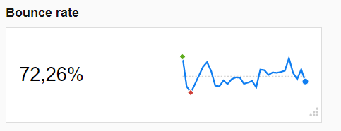
Indicator
When you have a single metric that you want to emphasize, like total revenue, then you can turn to counter, gauge or other numeric indicators. They will show you how close or far you have to your goals. Use high-contrast color pairs to highlight meaning.
Here’s an example from our homebase, a counter with a trendline showcasing the fluctuations in bounce rate.
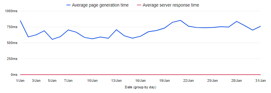
Line chart
Line charts are among the most common chart types because they offer a convenient way to display data that leaves no room for misinterpretation. You can use them to show trends in data across time intervals, like blog post views per quarter or price changes on the stock market over several years.
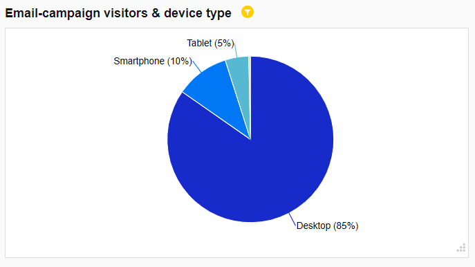
Pie chart
Pie charts, the bread and butter of data visualization. They’ve earned a bad reputation for being misleading. The truth is that it’s hard to compare the slices.
However, if you apply them to present relative proportions and percentages, you’ll get the job done. They are a good choice for visualizing a portion of your budget divided into different teams. To make them work, follow some simple guidelines:
- Don’t put more than six categories into your pie
- Forget about 3D charts as they trick your eyes into thinking some slices are bigger than they are in reality
- Use them for nominal variables, not ordinal ones
- Apply them for proportions and percentages, but not for comparing data
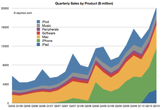
Area chart
Area charts are preferable when you need to display how one quantity changes over time. They come in handy when you need to present a trend across time, such as your product sales in Q3.
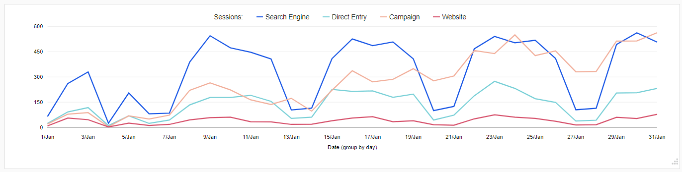
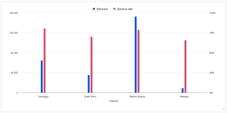
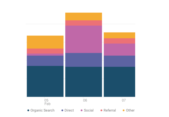
Bar chart
Bar charts, also known as column charts, come in handy when showing the contrast between different values. You can use them for nominal variables, such as the types of organizations your conference participants work in, or the social media channels your app users spend the most time on.
Also, apply them to display your web traffic sources or visualize your budget allocation or product sales by region. All in all, both charts help you easily spot high and lows.
Here’s an example of a bar chart showing the bounce rate and number of sessions by traffic type:
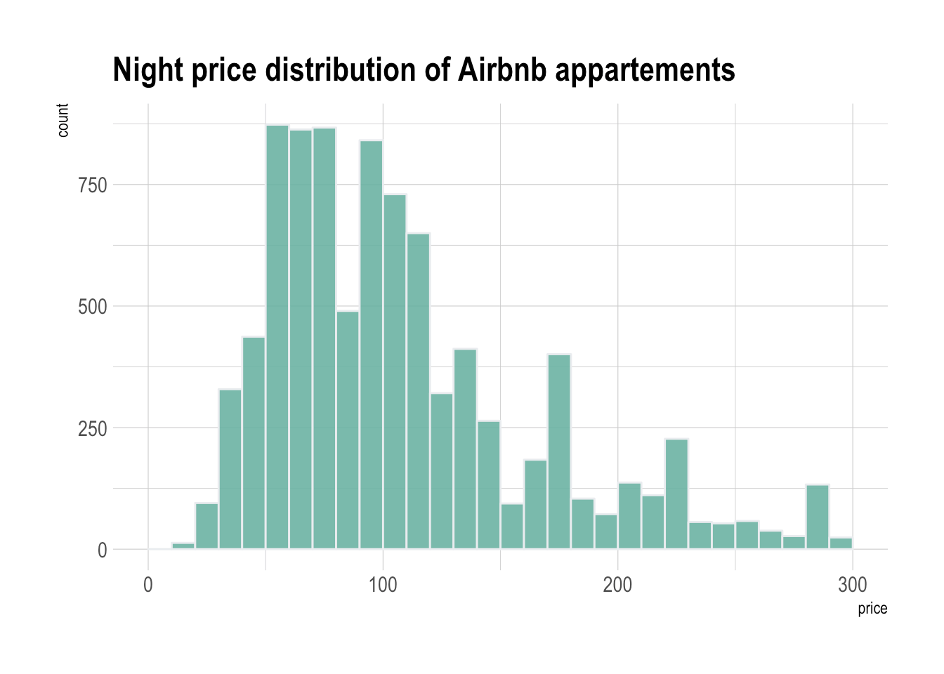
Histogram
Although histograms resemble column charts, they take a slightly different form since they group multiple columns into bins. In other words, they group data into categories, like customers aged 18-29, aged 30-39, aged 40-49 instead of showing each age as a separate piece. That could be suitable for grades or scores.
Histograms are great for displaying things like the number of clients by company size, student performance on an exam, or frequency of support hotline calls.
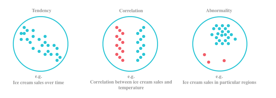
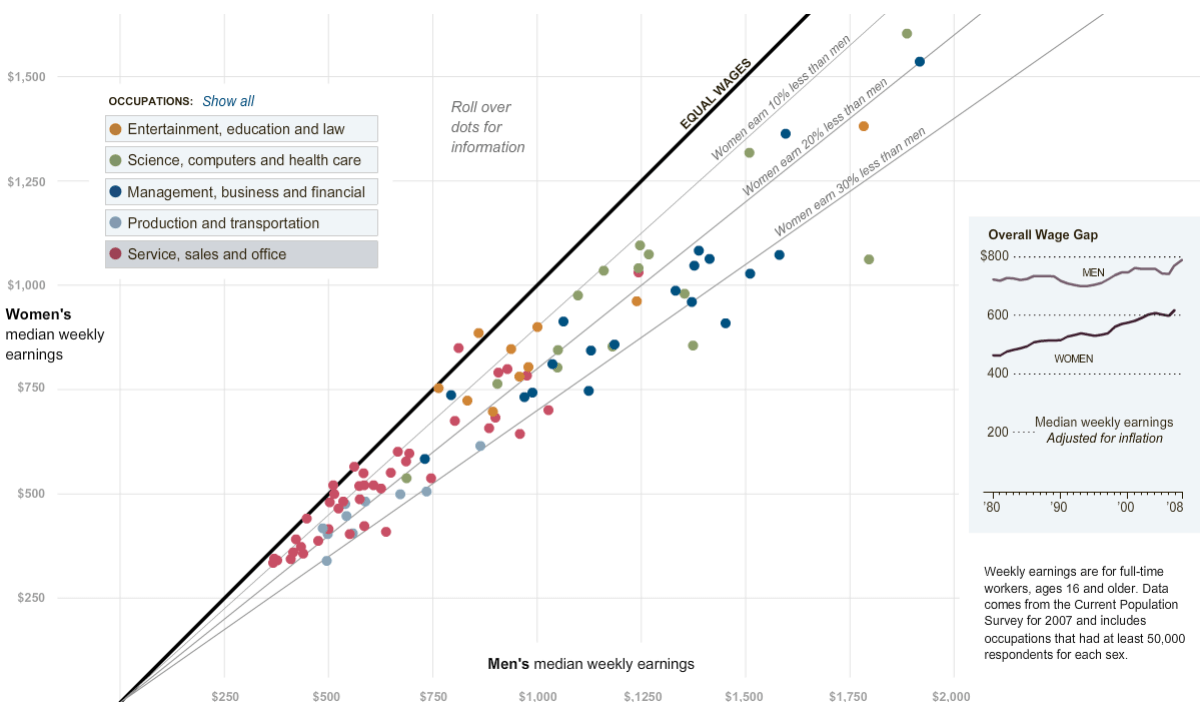
Scatter plot
To present distribution of variables and the correlation between them, you can use a scatter chart, also called a scatter plot. These use colored circles to represent categories and different sizes that reflect the volume of your data.
They provide you an effective method to illustrate trends, guiding the viewer to the data that needs the most attention. These charts are also great for discovering outliers.
You can also apply scatter plots to visualize technology early adopters and buying patterns of smartphone shoppers, or distribution costs of different product classes to different areas.
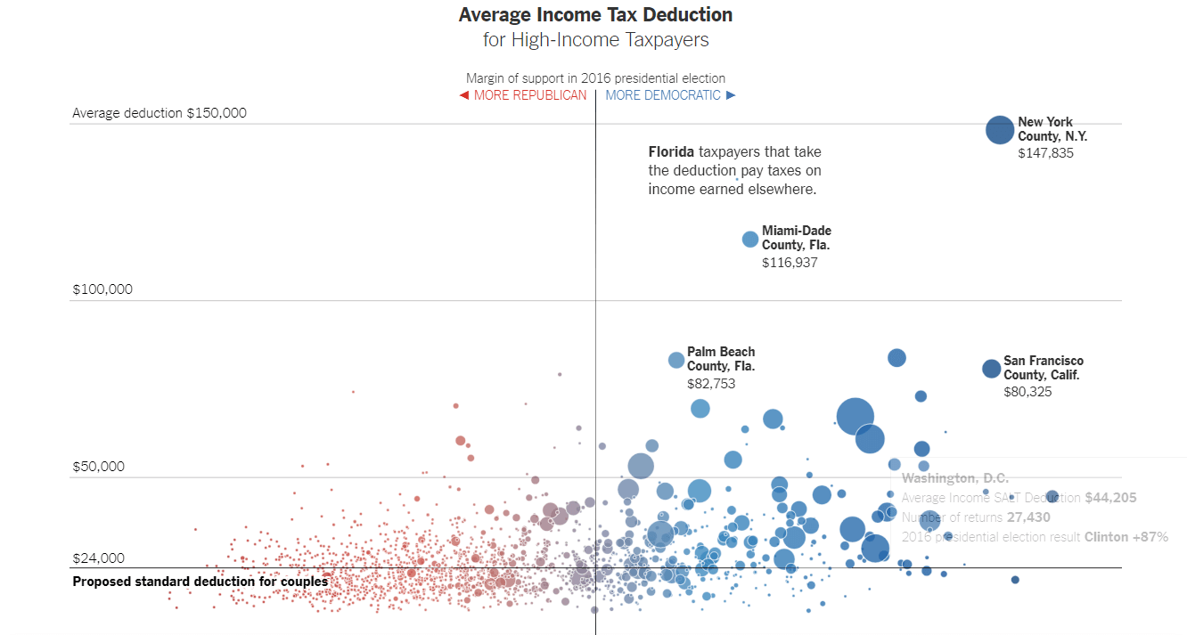
Bubble chart
Bubble charts are sort of advanced versions of scatter plots, with an added third dimension. What differentiates bubble charts is that they show many different values in one space. Bubbles vary in size as well as in colors, which amplifies their impact.
You can apply them to present data concentrations along both axes. That could be useful to show sales concentration divided by your product and geography, highlighting the regions where sales are the worst and helping you spot where you can improve results.
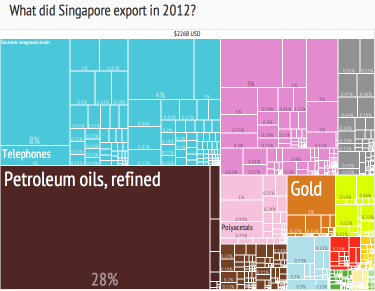
Treemap
If you’re looking for a way to show hierarchy or compare proportions across categories or even subcategories, consider using treemaps. They’re really space-efficient, as they nest colored figures inside each other, typically rectangles. Both color and size dimensions correlate with the overall structure and you can spot patterns at a glance.
Treemapping is useful when you need to show, for instance, software usage across departments, units within one company, or compare your budget spending between years.
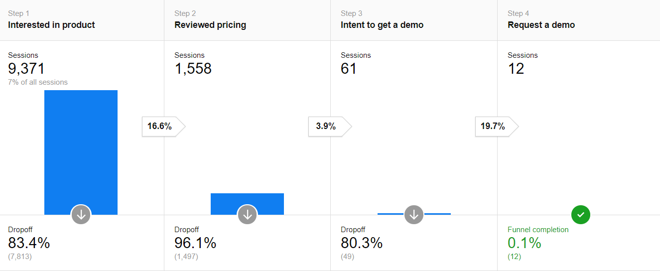
Funnel chart
Funnel charts are a great way to demonstrate stages of various processes like sales cycles, and help to spot potential roadblocks. A funnel typically starts with 100% and then progressively narrows towards the bottom, allowing to easily identify the stages impacting the reduction in value.
Apply funnel charts to showcase:
- Website visitor trends
- Sales conversion
- Order fulfillment
- Success of a promotional campaign
- Evaluation of recruitment process
- Information flow, from top secret to unclassified
Data visualization in web analytics – Best practices
We’ve already discussed some factors that you need to be aware of if you want to make your visualizations work. There are, however, a few more guidelines that will help you and your end users to get the most out of your analytics reports.
Keep it simple
“A story is more likely to take hold in the minds of your audience if you tell it simply. You must identify the essential message and then present it as simply as possible without distraction.”
This advice from data visualization expert Stephen Few should always be kept in mind when developing your visualization tactics. That’s also the golden rule for every analytics report. No matter what presentation method you choose, keep your charts and dashboards concise and simple.
It’s especially easy with web analytics records to overload your dashboard with visuals or unnecessary data. Remember the KISS principle – Keep It Short and Simple!
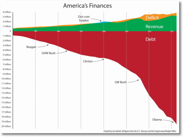
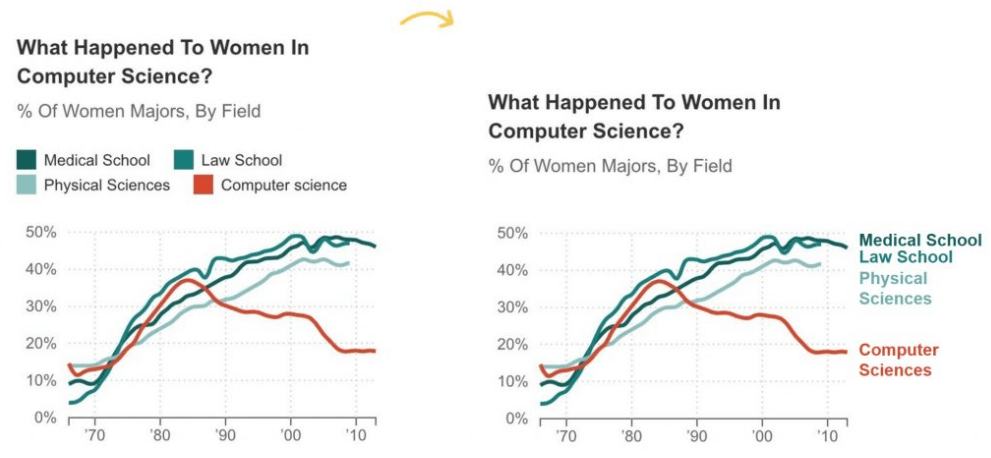
Consider two examples analyzed by Avinash Kaushik. The first one presents what you’ll get if you try too hard to communicate too much info in a single graph and forget about the context:
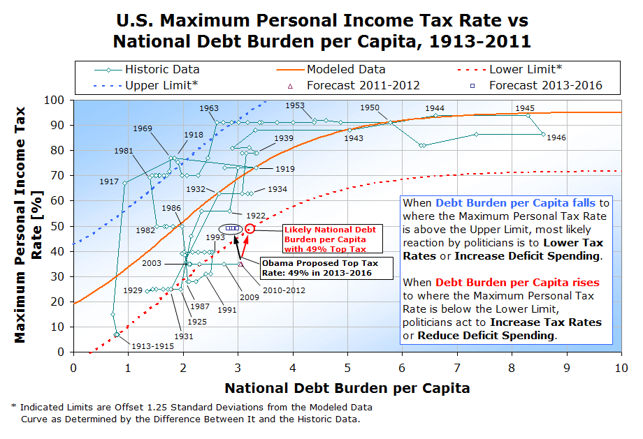
But there’s a better way – more direct and less ambiguous – to tell a complicated story in one chart. Have a look at the USA National Debt Burden:
In this case, you don’t need any additional aids to clearly see the problem. That’s exactly the effect you’re aiming for with your visuals. You want a single chart that gets your message across to others, not just to yourself.
Play around with colors
As you craft your graphs, you should strive to make them easy to understand. Colors play a big part in this process. You don’t have to be a graphic designer to take advantage of them.
Ann K. Emery, an expert data visualization designer, suggests a few ways to make meaningful use colors and improve your data storytelling.
1. Select color palettes
If you don’t know how to apply colors for your reports, the three key color schemes come to the rescue:
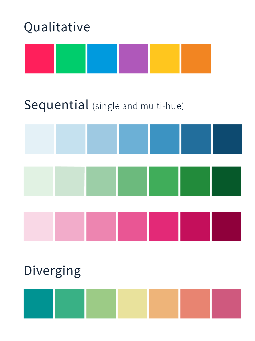
A qualitative scheme, also called categorical, using contrasting numerous hues is a great fit when displaying different data categories. This is great for distinct product types or basic categories like gender and ethnicity.
A sequential palette is a range between just two colors, from a lighter shade (or even white) to a darker one. You can use this scheme when your data has a single numeric value follows some kind of order ranging from high to low. The bright colors should mirror low values and the dark ones represent higher ones.
This kind of scheme allows you to display progress, like temperature changes, the density of traffic, age ranges, or time periods.
A diverging palette should be your choice when your quantitative data has two extremes that share a mid-point. The scheme usually consists of three or more colors, which should be distinct, with a neutral one in the middle. The contrasting hues instantly present large differences between data values.
Important! Include labels and other elements in your palette schemes so users won’t have to decode your graphs.
2. Highlight the key message with a color
Colors greatly improve the overall effect of your visuals by emphasizing the most crucial information in your graphs. Use different hues to guide users to key messages and insights.
Use labels, descriptions, and annotations
To improve your data visualization and storytelling, your charts should include labels, descriptions, and annotations for complete clarity and to make it easier to remember the key issues.
Labels and titles state the purpose of your chart while descriptions provide additional context, such as data sources.
Annotations and call-out boxes added to your chart provide contextual details and make your visuals easier to understand.
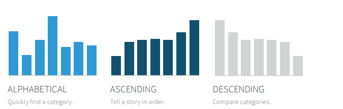
Keep your charts in order
Besides choosing your visualization medium, it’s important to sort your charts in the right order. Proper sorting makes it much easier to understand without spending too much time figuring things out.
Employ grid lines sparingly
Adding grid lines to your charts and graphs provides thresholds that better communicate whether you’re reaching your targets or perhaps crossing spending limits. In a general sense, those lines help in comparing values.
However, use them carefully to avoid blurring the message you want to express. They should be subtle to avoid distracting readers.
Final thoughts
Translating your data into visual content that communicates your insights, findings, and recommendations is no easy feat. It takes not only the right tools, but most importantly a sound long-term strategy.
We trust that today’s post will help you apply data visualization methods to improve your reporting and decision making. If you’ve got any burning questions about this or any other analytics issues, reach out to us and the Piwik PRO team will be glad to respond right away.