
This article is the second of a three-part series about the FTG framework – a web analytics model designed with the websites of public institutions in mind. The framework was created by Toon Vuursteen, a Dutch thought leader in digital analytics for the public sector, now supporting the digital transformation of GBBO, an agency specialized in researching and optimizing online governance service channels.
Part 1: Web analytics for governments: The framework for setting the right KPIs
Part 3: Web analytics for governments: Working with operational KPIs
The series presents how adopting the model allows public institutions to:
- Replace intricate analytics reports with intuitive and user-friendly dashboards
- Work with data that is essential for their goals
- Easily recognize pain points, prioritize changes and serve citizens better through their websites
- Maintain the highest privacy standards thanks to a safe analytics platform (Piwik PRO)
In the previous article, we’ve walked you through the ABCs of the FTG framework. We encourage you to read it before starting this one.
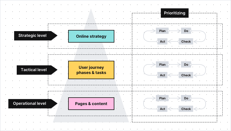
Today we’d like to present real-life applications of the model. We’ll begin with KPIs and metrics from the levels of strategic and tactical goals (top and middle parts of the pyramid). They show how well you’re doing in terms of:
- Pursuing your online strategy
- Providing citizens with a smooth user journey through your website
In the next article, we’ll focus on the use cases related to the operational goals and the effectiveness of individual web pages.
Single digital gateway integration (SDG) for government organizations
Single digital gateway integration (SDG) for government organizations
Transfer all the necessary information to the single digital getaway automatically to easily comply with EU regulations. Use the integration to send the Piwik PRO monthly report to SDG. The report includes information on page views by country and device for each URL. The integration is available upon request to all our users. Read more on SDG integration.
Web analytics for governments: How to work with strategic KPIs for your website
Let’s imagine that you work in the municipal office in one of the biggest cities in the region. Your team’s duty is to make sure that the office’s website serves citizens well, giving them easy access to public information and services.
One of the main principles of the framework is that you start looking for what’s potentially wrong from the very top, and then go down into the details. So, the first thing to do is to check if you’re on track with the most high-level goals your organization has set:
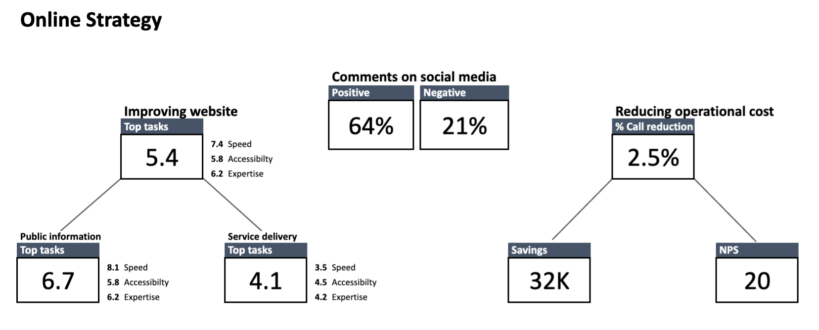
Here’s how to read the dashboard: Starting from the left, you can see the KPIs reflecting your three main strategic goals – speed, accessibility and expertise.
Important note: KPIs from the level of strategic goals are different for each organization, as every institution has its own duties to perform. The dashboards presented in this article are based on the goals chosen for one of Toon’s clients. Because the data of Toon’s clients is confidential, the information presented on the dashboards is anonymized.
The box at the top shows the overall score of all the tasks users performed on your website. Below are the task scores broken down into two groups: public information and service delivery.
To make sure we’re on the same page:
Public information – means finding a relevant piece of information on a website (e.g. an announcement or blog post)
Service delivery – means getting access to services provided by your institution (e.g. applying for an unemployment benefit or renewing a driving license)
Speed – On a scale from 0 to 10, this reflects how quickly citizens are able to find the information or service they’re interested in. It’s calculated by taking into account all the tasks users undertake on the website and the time it takes them to complete those tasks.
Accessibility – On a scale from 0 to 10, this reflects how easy the website is for an average citizen to understand and how easy it is for people with disabilities to access. It can be measured:
- With e.g. Siteimprove, a tool that helps to spot and fix accessibility problems on your website
- With the summed “ease of completion” score from all the tasks (the exact method is presented in the next chapter)
- By creating segments of people with disabilities, e.g. users who turn on the voice menu. Tracking this data allows you to detect and remove any barriers they encounter when navigating through your page
Expertise – On a scale from 0 to 10, reflects how well the content of the website informs citizens. It’s determined by combining the two types of data:
- The answers from the satisfaction surveys placed on the pages related to the most important tasks on your website
- The overall scores of the pages included in the crucial tasks on your website
In the center of the dashboard, you can see a KPI related to comments on social media. In this example, sentiment on social media is also tracked and presented at the strategic KPI level. It’s measured with the use of social media monitoring tools.
Finally, on the right you see KPIs related to reducing operational costs. It could be, for instance, decreasing operational costs by improving access to information and services through online channels. Additionally, you could also track net promoter score (NPS), which tells you how likely citizens are to recommend a service to friends and family.
Strategic level of the FTG framework: How to read the data
Although the strategic dashboard doesn’t solve specific issues, it hints at where to look for solutions.
A good rule of thumb is to focus on the areas in which you score the worst. For example, here you can see that the score for service-related tasks is critically low, at 4.1. It means that citizens are facing some major obstacles when trying to access your services.
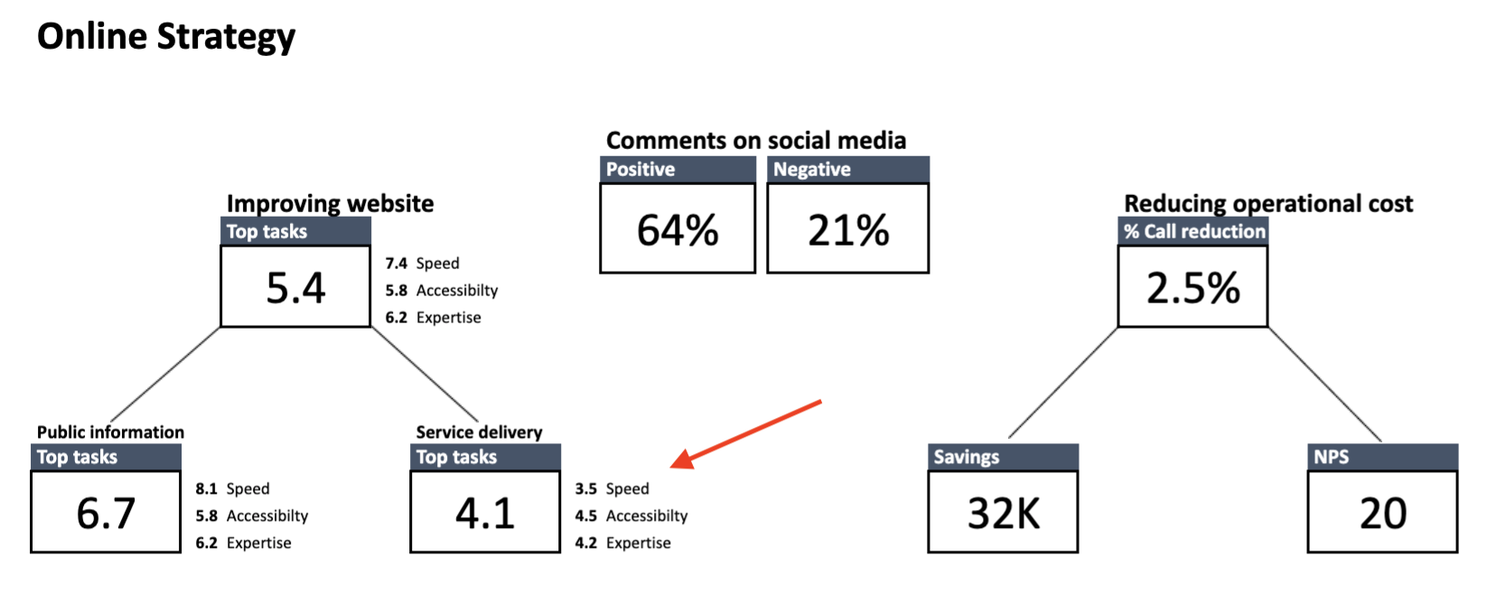
What’s more, you know that the number of phone calls received by the municipal office jumped significantly month-on-month. From talks with the staff answering the phones, you also know that plenty of those calls concerned parking permits.
Now that you have some clues as to what could be causing the trouble, it’s time to dive deeper into the data and test your hypothesis against the statistics from the lower-level dashboards.
Web analytics for governments: How to work with tactical KPIs
The level of tactical goals comprises two dashboards – one concerning stages of the user journey and the other one that concerns the tasks users undertake on your website.
To make sure we’re on the same page:
User journey is the path a citizen takes as they interact with your organization. This journey consists of phases.
Task is a smaller piece of data about user behavior on your website. It describes a set of actions users perform to find specific information or access a service. Every task belongs to a certain user journey phase.
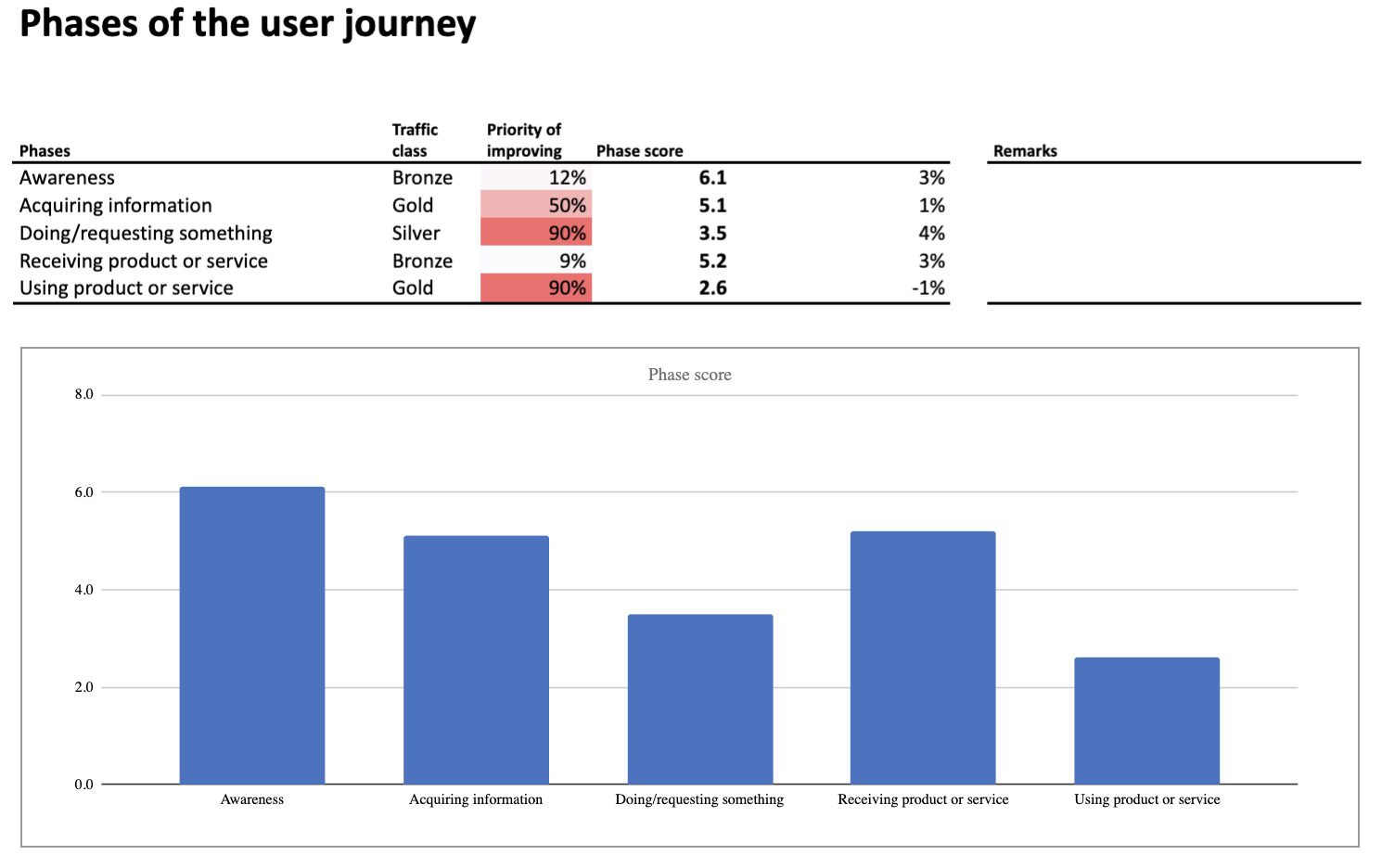
Phases of the user journey can be arranged in many ways and include different user tasks. In this case they’re presented with a modified AIDA model, where:
Awareness – Describes tasks related to informing citizens on certain topics. It’s the phase in which e.g. you announce to citizens that parking permits are now being distributed by the municipal office.
Acquiring information – Describes tasks users perform when they search for content or service they are interested in. It’s the phase in which e.g. users look up the opening hours of the municipal office or check the prices of parking in their neighborhood.
Doing/requesting something – Describes tasks related to requesting a given service. It’s the phase in which e.g. users apply for a parking permit.
Receiving something – Describes tasks that include getting access to a certain service. It’s the phase in which e.g. users receive an email informing that their parking permit is ready to be collected.
Using product or service – Describes tasks related to inquiries about services the user already takes advantage of. It’s the phase in which e.g. users renew their parking permit or exchange their current permit for one valid in a different parking zone.
Performance of the phases is calculated by taking into account:
- Phase score – KPI based on the scores of all tasks from a given phase
- Priority of improving
- Growth – Improvement rate that compares the current score with the score from the previous period
- Traffic class – Popularity of the phase expressed in the class from diamond (most popular) to tin (least popular)
Tactical level of the FTG framework: How to read the data about user journey phases
The dashboard indicates issues at the two steps of the user journey:
- Doing/requesting something
- Using product or service
The underperforming phases have the lowest scores and are marked in red, which makes them impossible to miss.
With this information in hand, you can drill down into the data and look for more clues. You’ll do it by exploring the next type of dashboard, concerning performance of the most important tasks.
Task performance
Each of the phases has its dedicated dashboard. Here are the metrics and KPIs that you’ll find on the “Top tasks” dashboard related to the phase “Doing/requesting something”:
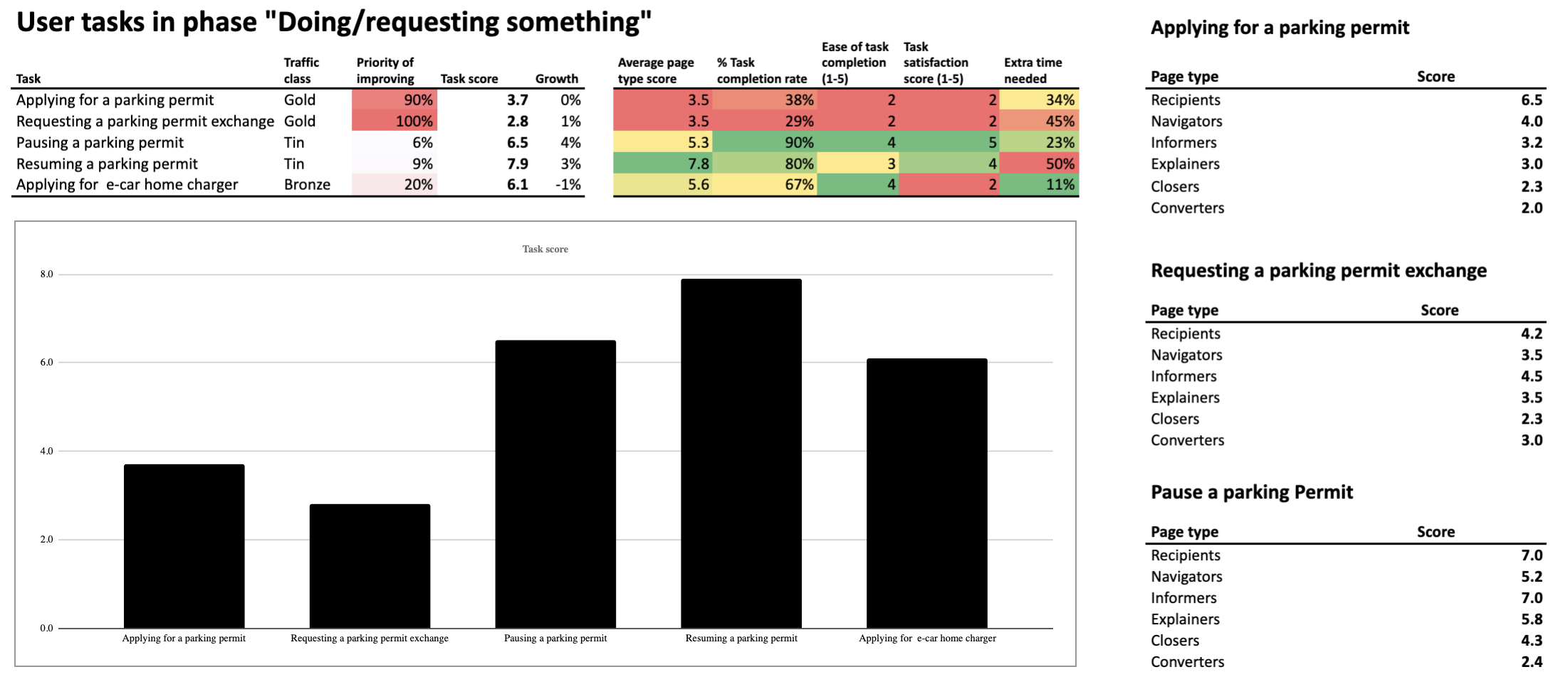
Let’s start with analyzing the metrics placed in the center of the dashboard (the ones highlighted in green, yellow, orange and red):
1) Average page type score – Reflects how well different page types are performing in supporting citizens in their task. It’s measured based on the metrics from the right section of the dashboard.
If you’d like to learn how Toon’s team calculates the score for each page type, be sure to check our next blog post. There, we’ll tackle use cases related to operational goals for your website.
2) Task completion rate – It’s the percentage of people who undertook a given task and completed it. This metric is calculated with the use of funnel reporting, which lets you track visitors’ steps and see the stage at which they drop off. The data is then paired with the results of the user survey in which visitors are asked if they succeeded with finding information or service they need.
Creating surveys is possible by using an external tool or with the content personalization features of Piwik PRO Tag Manager. In both cases, survey data can be integrated with analytics data in Piwik PRO Analytics Suite.
3) Ease of task completion – Indicates how easy it was for a user to perform a given task. This metric is determined by asking a question: “How easy was it for you on a scale from 1 to 5?” (where 5 means the easiest).
4) Task satisfaction rate – A score representing how satisfied citizens are with the way the website supports their task. This rate is calculated based on the answers from a satisfaction survey placed at the bottom of the page, scored from 1 to 5, as in the previous example.
5) Average completion time vs. the fastest possible completion time – The difference between the fastest completion time against the average time in which users complete the task. It’s expressed in percentage points. If the difference is significant, it means that there might be some serious UX issues that prevent users from reaching their goals faster.
In the left section of the dashboard, you see the KPIs – key metrics used to assess your website’s performance on the level of tactical goals. The most important among them is task score (overall score) KPI, calculated based on all the metrics presented above.
The task score is tied to two more KPIs:
– Priority of improving
– Growth
The traffic class metric also helps to determine which tasks require the most attention – the more popular the task, the more important it is to improve its performance.
Tactical level of the FTG framework: How to read the data about top tasks
The breakdown of the tasks allows you to spot issues with:
- Applying for a parking permit
- Requesting a permit exchange for people who have relocated to a different parking zone
Those are the tasks with the biggest rate of metrics marked in red and orange. The numbers say that they’re difficult to complete, leave users unsatisfied with their experience and take longer than expected. Finally, their “Priority of improving” indicates that fixing them is crucial for optimizing your website’s performance.
There is a good chance that these are what’s dragging down your website’s overall statistics.
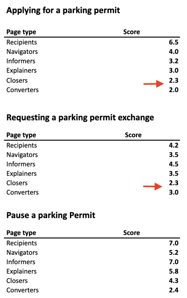
By exploring the data from the right section of the dashboard, you can spot which webpage types within a given task score the worst. Those are:
Closers – Pages that lead the user into a transactional process, e.g. to the page where they can perform the desired task
Converters – Usually a web form where users can send their applications or complete other tasks
Low scores at the final steps of tasks often indicate issues with web forms. Sometimes the forms are too long. Sometimes the instructions to the forms are difficult to grasp for an average citizen. But it could be something else.
Whatever the problem may be, you’ll uncover it by examining the web forms related to tasks where users apply for parking permits or request a permit exchange. Because now you know exactly where the issues occur.
To make this quest easier, you can also use dashboards from a lower level of the framework. Those are the dashboards that investigate the performance of individual websites and page types. If you’d like to know how to work with this data, read our next article where we’ll tackle the operational goals for public websites.
Conclusion
Improving the performance of public institutions’ websites calls for a comprehensive approach – keeping track of the relevant metrics, applying the necessary changes and then checking if they’ve brought the desired results. That said, working with a web analytics framework designed specifically for public institutions makes the whole process much easier and more efficient.
If you’d like to learn more about the FTG framework, be sure to contact us – we’ll be happy to fill you in on the details. In the meantime, stay tuned for the last article in the series.