
One of the main goals of the public sector institutions has always been to be transparent and give citizens consistent access to public services and information. At the same time, it’s necessary to optimize costs, improve efficiency and better allocate resources.
What has changed is that now institutions deal with many of these tasks through websites and applications. And to ensure citizens with the best experience in these touchpoints, they require access to meaningful analytics data.
However, making analytics work is more difficult for those in the public sector than it is in the private sector. This happens for many different reasons, including:
1) Lack of internal expertise
Unlike private firms, public sector institutions often can’t afford in-house teams with the technical expertise required to install, implement and maintain the analytics software. Not to mention analyzing the data and drawing relevant conclusions from it.
2) Less defined goals
In a commercial environment, key performance indicators (KPIs) reflect sales targets and customer lifetime value. In contrast, public sector websites are more content- and service-oriented. So KPIs and goals tend to be less straightforward and more difficult to set.
3) Privacy and security constraints
Finally, trusted public organizations should set an example for responsible handling of data, as they process highly sensitive information such as health, tax and court records. Data protection measures need to be airtight, otherwise they risk violating citizens’ privacy rights as well as damaging their own good name.
A solution: The FTG framework
The good news is that there is a way to overcome these issues. The answer to the needs of public institutions is the FTG framework (Functie-Taak-Gedrag in Dutch), created by Toon Vuursteen. Toon is a web analytics advisor and educator for the public sector, working for GBBO, an agency specialized in researching and optimizing online governance service channels.
Years of experience in the field has allowed Toon to come up with a solution that gives the organizations three important analytics assets:
- A new mindset for measuring and optimizing their digital presence
- A ready-made set of KPIs developed with content- and service-oriented websites in mind
- Intuitive dashboards that replace confusing charts and reports, making it easy to spot the areas that require the most attention
Considering the strict privacy and security requirements in the public sphere, Toon turned to Piwik PRO Analytics Suite to put his ideas into practice.
Our new series of blog posts will describe the ins and outs of the FTG framework. In this article, we will focus on explaining the key notions of the methodology. The next ones will present practical use cases for measuring the effectiveness of the public institution websites.
Let’s get started.
Anonymized data – Because the data collected by Toon’s clients is strictly confidential – all the data shown on the dashboards in this blog series is anonymized.
Setting up KPIs for government websites with the FTG framework
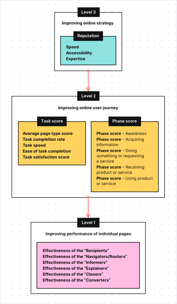
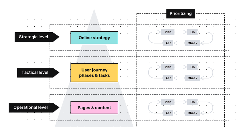
The most important concept of the FTG model is that it breaks the KPIs into smaller groups, so they are easier to track and understand:
- Level 3: Shows you how well you’re performing in terms of your strategic goals
- Level 2: Shows you if the digital user journey on your website is pleasant and easy
- Level 1: Shows you if the individual pages of your website do their job well
To make sure we’re on the same page – key performance indicators (KPIs), sometimes called key success indicators, are metrics organizations track in order to check their performance against the goals. It’s your KPIs that hold the key to improving performance of your website.
The KPIs at Levels 1 and Level 2 are typically the same for each organization. More differences occur at Level 3, as every institution has its own duties to perform.
If you’re interested in how this hierarchy might look like, here you can find a sample KPI set for one of Toon’s clients, the Dutch court system – Rechtspraak:
Now, let’s discuss in detail what you can see on this graph, starting from the very top.
Level 3: Strategic KPIs for the public sector
These are the most high-level objectives for a website – the ones that define your online strategy. For many public institutions, those KPIs will be related to their reputation and therefore to citizens’ satisfaction.
Here you can find a sample dashboard with the strategic KPIs of the Rechtspraak:
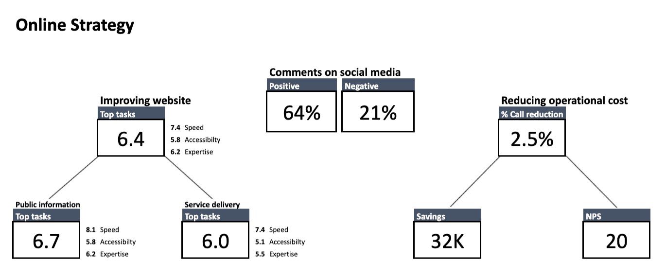
As you can see, one of the important strategic KPIs is the top task score, under the heading Improving website, with three sub-KPIs:
- Accessibility – Reflects how easy the website is to understand for an average citizen and how accessible it is for people with disabilities. The KPI is measured with the use of tools such as Siteimprove.
- Speed – Reflects how quickly citizens are able to find the information or service they’re interested in. It’s calculated by taking into account all the tasks users undertake on the website and the time it takes them to complete those tasks.
- Expertise – Reflects how well the content of the website informs citizens. It’s determined by the answers to the satisfaction survey placed at the bottom of content pages. The survey contains the following questions: Q1: Was this page useful? Q2: Was this page understandable?
In this case, sub-KPIs are tracked separately for two types of tasks people can perform on the office’s website:
- Public information – finding a relevant piece of information on a website
- Public service delivery
Sometimes, as in the example above, strategic goals are related to finances. It could be, for instance, that decreasing operational costs is the result of improving the access to the information and services through online channels.
Additionally, tracking net promoter score (NPS) will tell you how likely citizens are to recommend a service to friends and family.
In this example, sentiment on social media is also measured and presented at the strategic KPI level. This is because the client’s reputation is mission-critical.
Other strategic KPIs tracked by Toon’s clients include:
Findability – the percentage of users that have entered the content page via search engine. It also takes into account how many users have found the page via the internal search of the website.
Ease of use – calculated based on the Customer Effort Score question: How easy was it to perform the task you just did? (On a scale of 1 to 5: 1 being very difficult and 5 being very easy).
Level 2: Tactical KPIs for the public sector
Now that you know what strategic KPIs you want to track (e.g., speed or accessibility), you need metrics that will allow you to follow your progress. The way to do this is to analyze the complete journey of the users.
There are many kinds of information that citizens search for on your site and equally as many kinds of services they want to receive.
Depending on the sector you operate in, citizens may want to look up the text of a new law, check their constituency, file for unemployment or report a missing ID card. To do so, they need to enter your website and click through individual pages to find what they came for.
In the FTG framework, this set of actions is called a task. Whatever it might be, your role is to make sure that the whole process will be as smooth, pleasant and efficient as possible.
This way, you not only improve your results at the strategic KPI level, but also enhance the user experience of people visiting a website.
Metrics that help with tracking task performance are:
- Average page type score – indicates how well different page types are performing in supporting the citizen in their digital user task
- Task completion rate – the percent of people who undertook a given task and have completed it
- Task speed – the average time in which they’ve completed a given task
- Ease of task completion – the minimization of difficulties on the way to completing a task (e.g. unattractive or incomprehensible copy, overly long webforms, technical issues for certain browsers)
- Task satisfaction score – a score representing how satisfied citizens are with the way the website supports their task
Toon pinpoints underperforming tasks with the task score (overall score) KPI. The task score is accompanied by two more KPIs, being: Priority of improving and Growth.
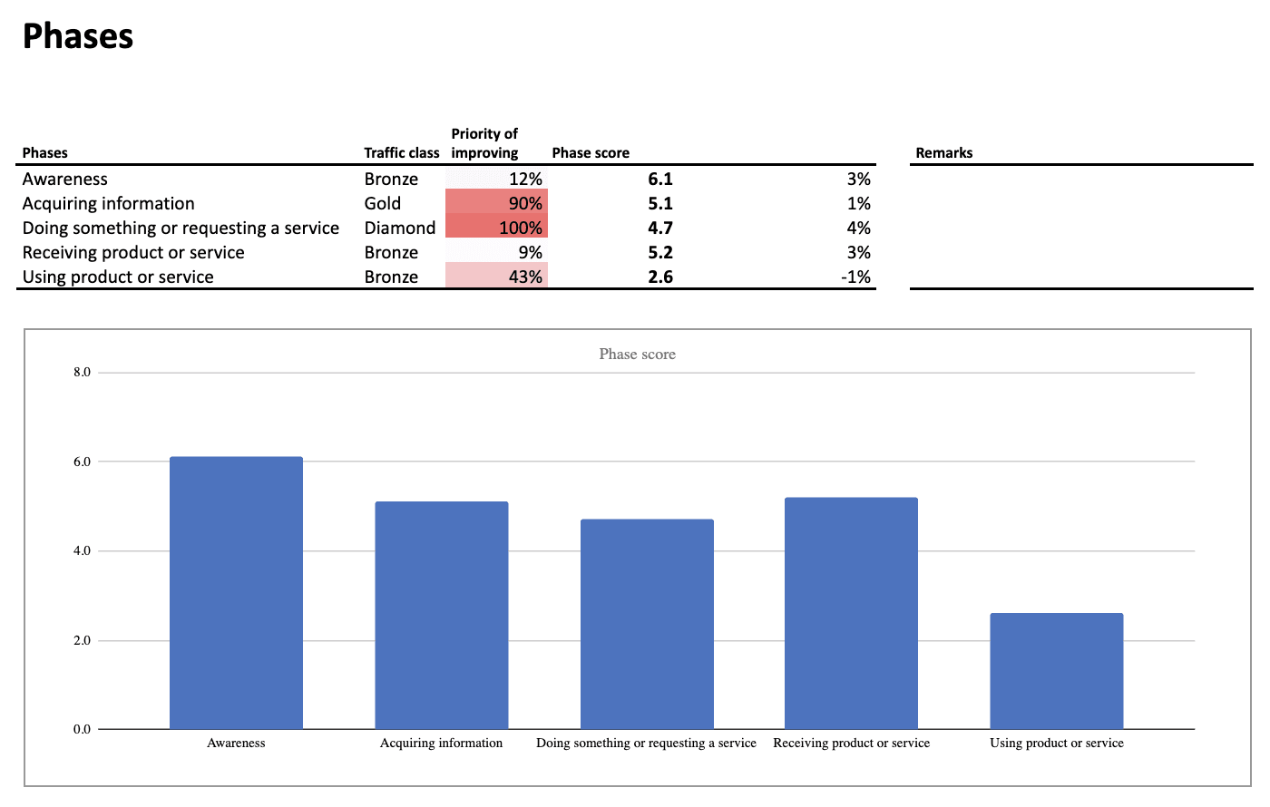
Below is an example of the KPIs for a Dutch municipality.
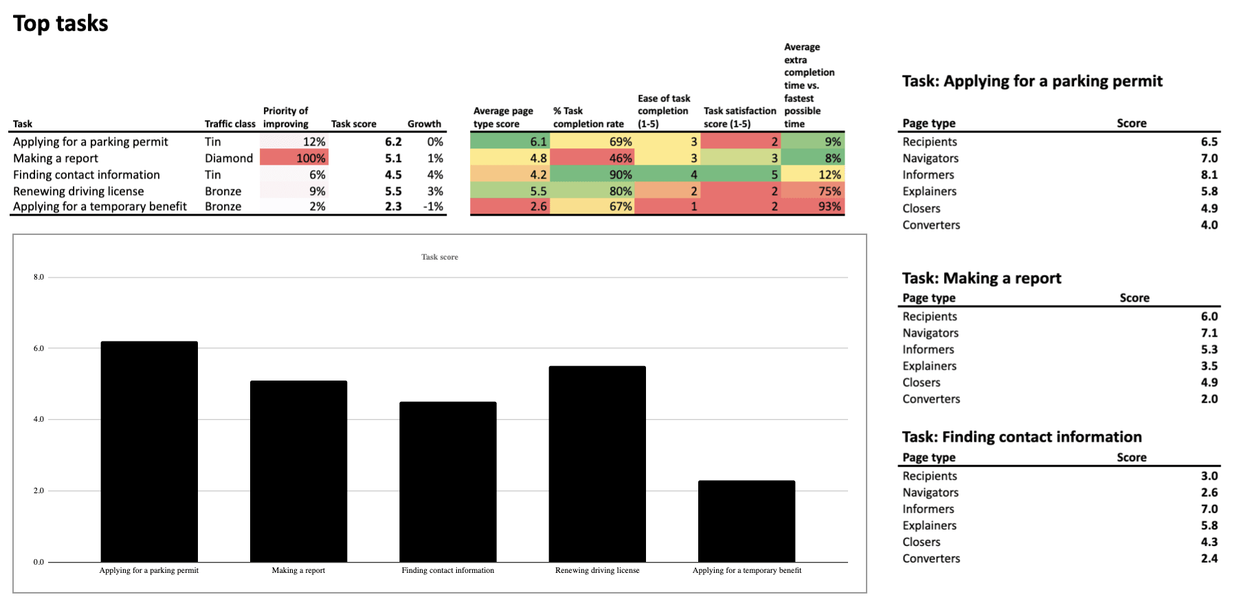
The second column (Traffic class) in the table shows the popularity of a given task expressed in the class:
- Diamond (most popular)
- Gold
- Silver
- Bronze
- Tin (least popular)
The priority of improving (third column) steers your effort towards optimizing the tasks that need the most attention. Vivid colors, red and orange, make them impossible to miss.
The examples above are demonstrated on Toon’s original dashboards. However, the data can also be presented in different ways, e.g. using Piwik PRO’s custom reports or external BI tools.
Tasks, in turn, can be grouped into categories that refer to phases of the user journey. They can be arranged in various ways, for example, with the use of a modified AIDA model:
- Awareness
- Acquiring information
- Doing something or requesting a service
- Receiving a product or service
- Using a product or service
This makes it possible to measure and optimize complete phases of the user journey instead of just optimizing tasks.
User journey is the path a citizen takes as they interact with a given organization.
Single digital gateway integration (SDG) for government organizations
Single digital gateway integration (SDG) for government organizations
Transfer all the necessary information to the single digital getaway automatically to easily comply with EU regulations. Use the integration to send the Piwik PRO monthly report to SDG. The report includes information on page views by country and device for each URL. The integration is available upon request to all our users. Read more on SDG integration.
Level 1: Operational KPIs for the public sector
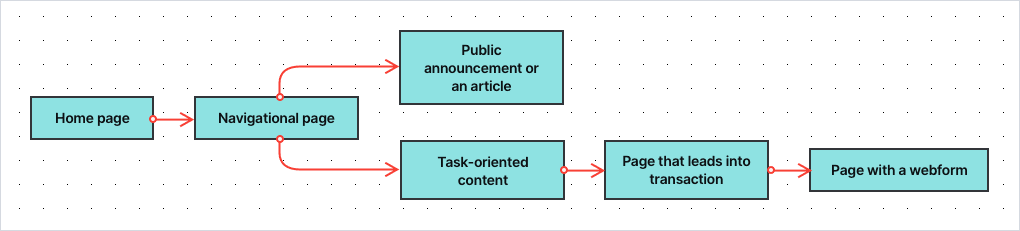
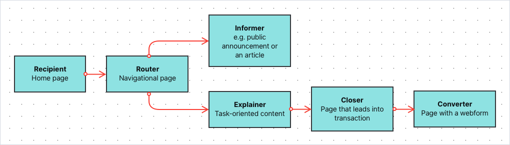
Finally, there are KPIs at the most granular level – the effectiveness of individual pages that are the building blocks for the entire user journey. According to Toon’s model, pages on public service websites can be divided into the following categories:
- Recipients – The general homepage and “homepages” of certain parts of the website – e.g. specific services or departments.
- Navigators/Routers – Pages with extensive menus linking to different parts of the website, as we see here:
- Informers – Content pages that present information, e.g. articles or public announcements
- Explainers – Task-oriented content that explains specific processes and procedures, e.g. applying for a benefit or filing a lawsuit
- Closers – Pages that lead the user into a transactional process, e.g. to the page where they can perform the desired task
- Converters – The last step in the transaction process, usually a web form, where users can place their applications or complete other tasks
This distinction is not fixed, as different pages may play several roles at once. However, using these categories allows you to understand what function a given page has in the user journey. It also lets you assign an appropriate set of metrics and KPIs to assess their effectiveness.
Depending on the type of page, you can measure your progress at the page-level using metrics such as (though not limited to):
- Page views – how many times a page has been viewed over a given time period
- Click-through rate – the proportion of users who followed a link to a particular site
- “Oops” rate – how often users went back and forth on the page in search of information (such behavior usually indicates that they weren’t able to find what they were looking for)
- Menu rate – how often users looked for information in the top menu of the page (this kind of behavior is undesired when the information should be easy to find in the body of the page)
- Search rate – how often visitors used search (the behavior is not always undesired, but often indicates that the page is not presenting what the user expected)
- Bounce rate / exit rate – how many users arrived at the page and ended its visit there
- Scroll depth – how far the user came down the page when browsing it
- Visits from SEO – how many people have entered the site through the search results
- Visits from social media – how many people have entered the site through social media channels
The collection of metrics will vary depending on the site’s category. For example, while for the “Informers” traffic sources, time on page and scroll depth play a significant role, on the “Navigators/Routers”, the “oops” rate and search rate will be way more important.
Based on chosen metrics, Toon calculates the same KPIs as for top tasks, such as:
- Priority of improving – how important it is to optimize a given page
- The overall score – how well this page is doing compared to other pages
- Growth – the progress of a given page over a certain period of time
Here you can find a sample dashboard for tracking the effectiveness of the “Recipients” (The homepage or the “homepages” of different parts of the website):
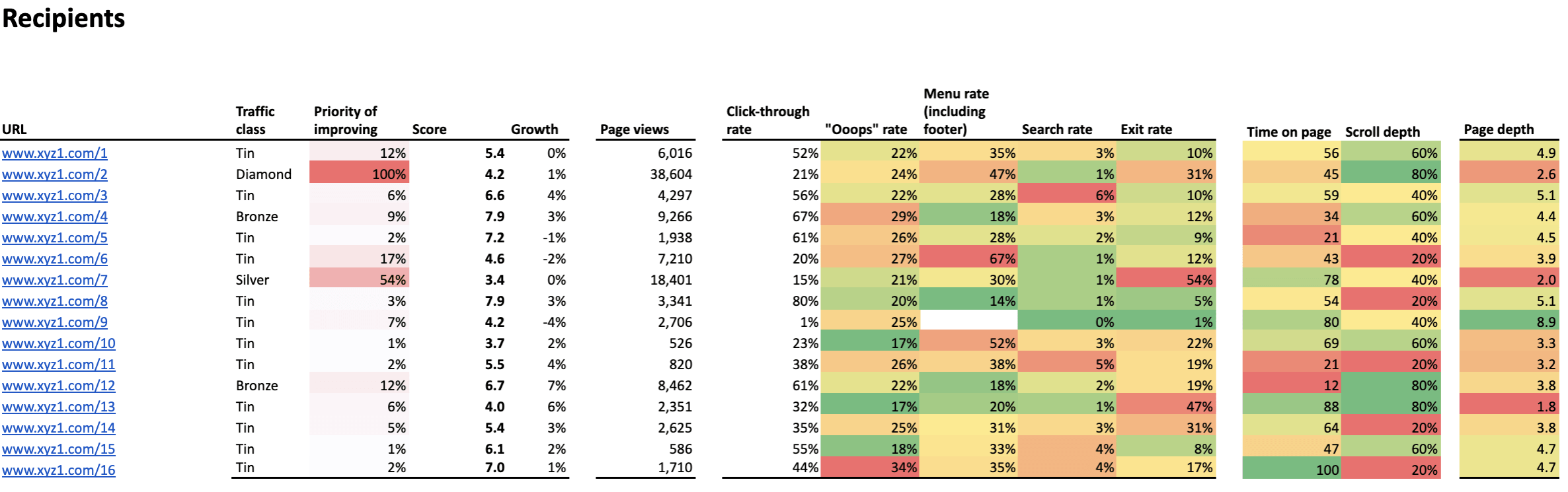
Again, cells marked in red and orange show the areas that require your attention, while the column named “Priority” helps you define which websites should be taken care of first.
Final thoughts
With all the KPIs and metrics set and all the dashboards arranged, you can analyze and optimize your organization’s website with data-driven methods for:
- The whole user journey
- Particular phases of the user journey
- The most important tasks users undertake on your websites
- The types of the pages
- The individual pages and content
Such detailed overview will allow you to:
- Locate pain points and prioritize where changes are most needed
- Make continuous improvement by analyzing data and running A/B testing
Read the parts two and three of the series:
Read the parts two and three of the series:
What’s also important is that after dedicated training, public servants will be able to use the dashboard and interpret data entirely on their own.
We hope that with this blog post we were able to shed some light on the principles and the biggest advantages of the FTG framework. At the same time, we’re aware that there are still many areas that need further explanation.
But don’t worry, we’ll cover them in future blog posts as part of our series. There we’ll show use cases of improving your efforts on the strategic, tactical and operational level. Stay tuned!