
This article is the third and last part of the series about the FTG (Functie-Taak-Gedrag in Dutch) framework – a web analytics model designed for the public sector. The framework was created by Toon Vuursteen, a Dutch thought leader in digital analytics for government, now using his expertise to support clients of GBBO.
From this series you’ll learn how public institutions can use this model to:
- Replace intricate reports with intuitive and user-friendly dashboards
- Limit their data collection to what’s essential for their goals
- Easily spot areas of their websites that require improvement to prioritize changes and provide better services and access to public information
- Stay aligned with the highest privacy standards thanks to a safe analytics platform (Piwik PRO)
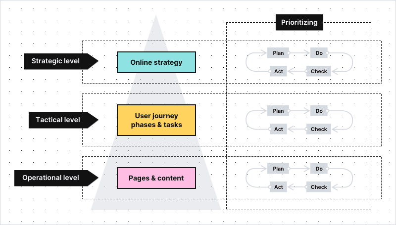
In previous articles we walked you through the principles of the FTG framework. We also presented real-life applications of the model, starting from the level of strategic and tactical goals.
We encourage you to explore the other parts of the series before reading this one:
We encourage you to explore the other parts of the series before reading this one:
Today we’d like to wrap up the series by showing you how to work with dashboards related to operational goals for your website.
Operational KPIs – a short introduction
The KPIs at operational level measure the performance of individual pages grouped into page categories, such as:
- Recipients
- Navigators
- Informers
- Explainers
- Closers
- Converters
Although single pages may seem small and unimportant, the opposite is in fact true. Why?
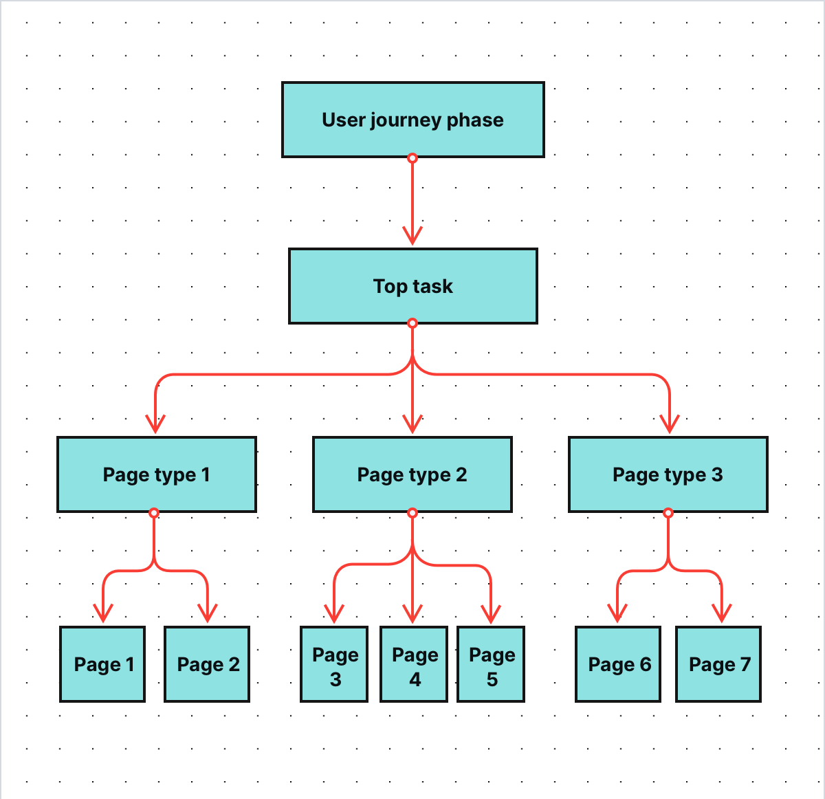
Pages are the building blocks of a website and have tremendous impact on its overall performance. Their statistics also influence the higher levels of the FTG framework – the levels that concern user journey phases, tasks and strategic KPIs.
COMPARISON
The comparison of 10 web and app analytics platforms
Learn the key differences between Piwik PRO Enterprise, Google Analytics 4, Matomo Cloud, Adobe Analytics, AT Internet, Countly Enterprise, Mixpanel Enterprise, Amplitude Enterprise, Snowplow Enterprise, and Heap Premier.
Single digital gateway integration (SDG) for government organizations
Single digital gateway integration (SDG) for government organizations
Transfer all the necessary information to the single digital getaway automatically to easily comply with EU regulations. Use the integration to send the Piwik PRO monthly report to SDG. The report includes information on page views by country and device for each URL. The integration is available upon request to all our users. Read more on SDG integration.
Types of pages on government websites
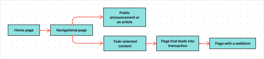
According to Toon Vuursteen’s model, you can divide pages on public service websites into the following categories:
- Recipients – The general homepage and start pages of other sections of the website, e.g. specific services or departments. Their goal is to welcome visitors, provide them with an overview of the website and direct them to the sections they’re looking for.
- Navigators/Routers – Pages with extensive menus linking to different parts of the website. These are all types of pages with a list of links to follow or options to choose from.
- Informers – Content pages that present pieces of information not related to specific tasks, e.g. articles, guides or public announcements.
- Explainers – Task-oriented content that explains specific processes and procedures related to the tasks, e.g. applying for or exchanging a parking permit.
- Closers/CTA page – Pages that lead the visitor into a transaction process, e.g. to a page where they can perform a desired task. It’s typically a page that provides further explanation and contains a call to action to the transaction (conversion) page or web form.
- Converters – The transaction process, usually a web form, where visitors can place their applications or complete other tasks. In most cases, each step in a form is treated as a separate page. This way you’re able to spot at which step people drop off while filling out the form.
Grouping pages into categories lets you assign an appropriate set of metrics and KPIs to certain pages – after all, every page type serves its own purpose and has different goals. It also allows you to understand what function a given page has in the user journey and the tasks visitors perform on your website.
How to measure the effectiveness of page types
Because each page type is different, you also use a different set of metrics to track its performance. Depending on the type of page, you can measure your progress with metrics such as:
- Page views – How many times a page has been viewed over a given time.
- Click-through rate –The proportion of visitors who clicked a navigational link on a page.
- “Oops” rate – The proportion of visitors who clicked the wrong link and went back and forth on the page in search of information. It indicates that they weren’t able to find what they were looking for.
- Menu rate – The proportion of visitors who looked for information in the top menu of the page or in the footer. It indicates that the page is not presenting the information the visitor has expected.
- Search rate – The proportion of visitors who used internal search. It indicates that the page lacks the information visitors were looking for.
- Contact rate – The proportion of visitors who visit the contact page and look for e.g. an email address or a phone number of your organization, indicating a channel switch to more expensive customer channels.
- Bounce rate – The proportion of visitors who landed at the page coming from outside the website and ended their visit immediately.
- Exit rate – The proportion of visitors who explored the website for a while, then arrived at a given page and decided to leave.
- Scroll depth – How far visitors looked down the page when browsing it.
- Time on page – How long the visitor stays on the page.
- Extra time needed – How much extra time (%) a visitor needs compared to the fastest visitor.
- Entry rate from SEO – How many visitors (%) have entered the site through search results.
- Entry rate from social media – How many visitors (%) have entered the site through social media channels.
- Entry rate from news apps – How many visitors (%) have entered the site through news applications such as Google News and the apps of newspapers.
- Successive page consumption – The scroll depth of the page a user visited next.
- Subsequent conversion – The percentage of users who have visited a closer page and converted, e.g. filled in a form.
- End conversion rate – The conversion rate of the web form related to a certain task, e.g. applying for a ticket permit.
The collection of metrics will vary depending on the page’s category. Here’s a table explaining which metrics are important for each page type:
| Metric | Recipients | Routers | Informers | Explainers | Closers | Converters |
|---|---|---|---|---|---|---|
| Page views | ||||||
| CTR | ||||||
| Oops rate | ||||||
| Menu rate | ||||||
| Search rate | ||||||
| Contact rate | ||||||
| Bounce rate | ||||||
| Exit rate | ||||||
| Scroll depth | ||||||
| Entry rate from SEO | ||||||
| Entry rate from social | ||||||
| Entry rare from news apps | ||||||
| Successive page consumption | ||||||
| Subsequent conversion | ||||||
| Drop off rate | ||||||
| Time on page | ||||||
| Extra time needed | ||||||
| End conversion rate |
The metrics above are Toon’s basic suggestion. It could very well be that you decide to do things a bit differently. For example, the “Contact rate” could be measured not only at the router pages and explainer pages but also on other page types. That really depends on your website, your online goals and your creativity.
Good practices
The metrics above are all derived from web analytics data. It’s a good habit to expand the set of metrics with ones based on qualitative research and user feedback. We won’t elaborate on that in this article, but just to mention two of them:
- % of visitors who find a page useful
- A score of a page’s understandability (e.g. on a scale of 1 to 5)
Based on all metrics, Toon’s team calculates KPIs for each page type, such as:
- The overall score – how well this page is doing compared to other pages
- Growth – the progress of a given page over a certain period of time
Here you can see a sample dashboard for the navigators:
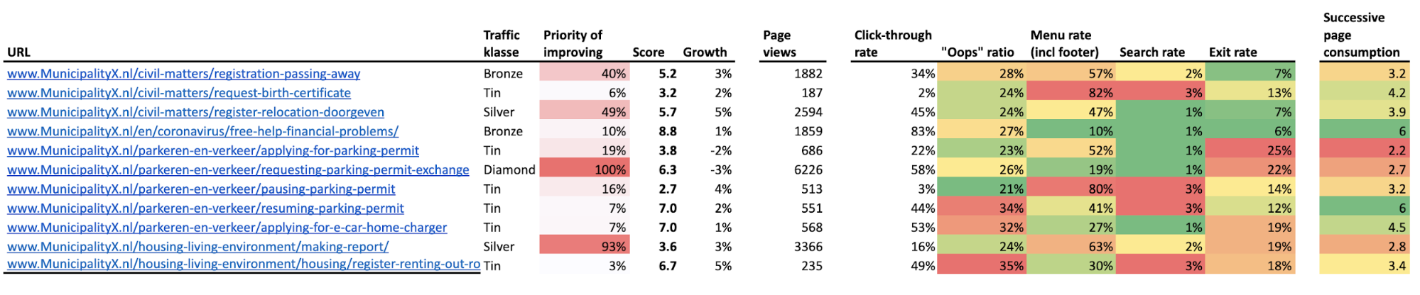
With all those metrics and KPIs in place, you can examine which pages are doing a good job and which require some improvements. You can also compare their performance to other pages that serve the same purpose.
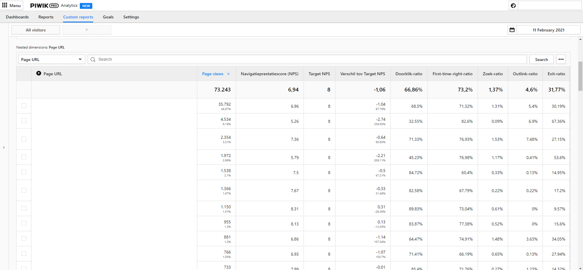
The dashboards for government institutions can be presented in a spreadsheet, in a data visualization tool or with the custom dashboards available in Piwik PRO. Here you can find a sample custom report for navigator pages:
The dashboards for government institutions can be presented in a spreadsheet, in a data visualization tool or with the custom dashboards available in Piwik PRO. Here you can find a sample custom report for navigator pages:
Working with operational KPIs – a helpful use case
Operational goals are the lowest, most granular level of the FTG framework. Typically, you get down to them after you spot problems on the dashboards concerning strategic and tactical goals. To show you how to utilize dashboards from the operational level of the FTG framework, we’ll get back to the use cases from the previous article.
pro tip
If you’d like to take a closer look at the previous part of the use case, visit this link.
To give you a short recap – in this use case, you work for one of the biggest municipalities in Western Europe. Your job is to make sure that the website of your organization is providing a stellar experience for residents. To do so, you work with the FTG framework and dashboards created by Toon’s team.
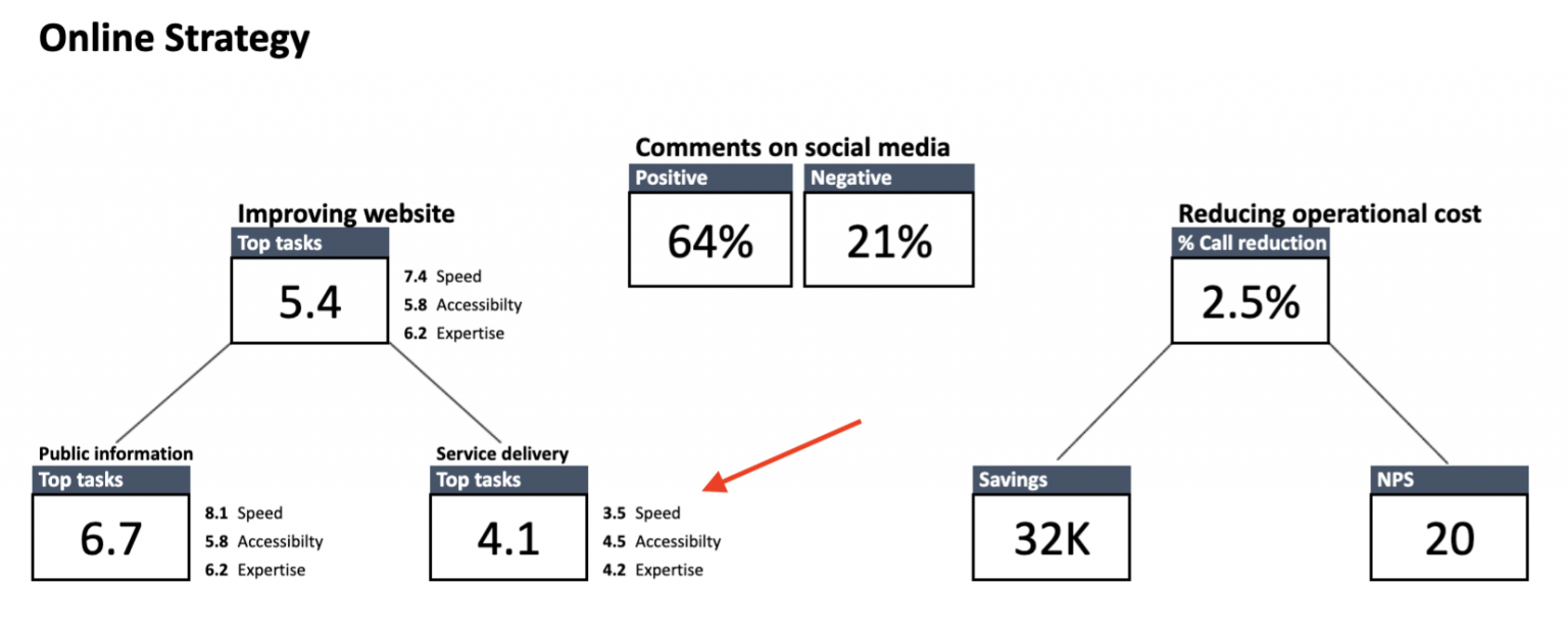
From the strategic-level dashboards you know that the score for service-related tasks is critically low, at 4.1. It means that citizens face major obstacles when trying to access your services.
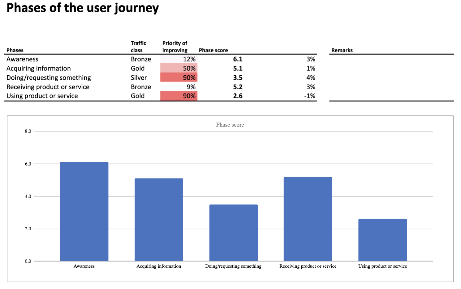
So you dig deeper. On the level of tactical KPIs, the following phases are underperforming:
- Doing/requesting something
- Using product or service
At the same time, the dashboard presenting KPIs for particular user tasks suggests you should investigate tasks related to:
- Applying for a parking permit
- Requesting a permit exchange for people who have relocated to a different parking zone
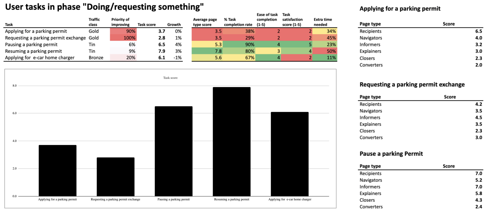
You can also spot that the page types known as converters and closers are performing really poorly. But to find out what’s causing the trouble, you need to go a step further and investigate the dashboards related to operational KPIs.
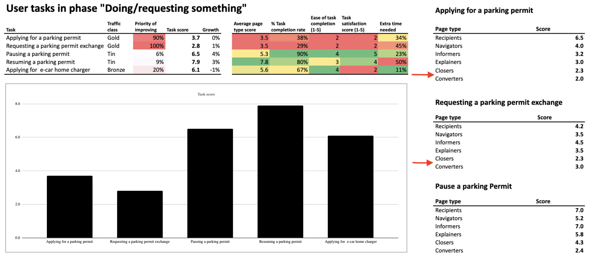
Let’s take a closer look at them.
Closers
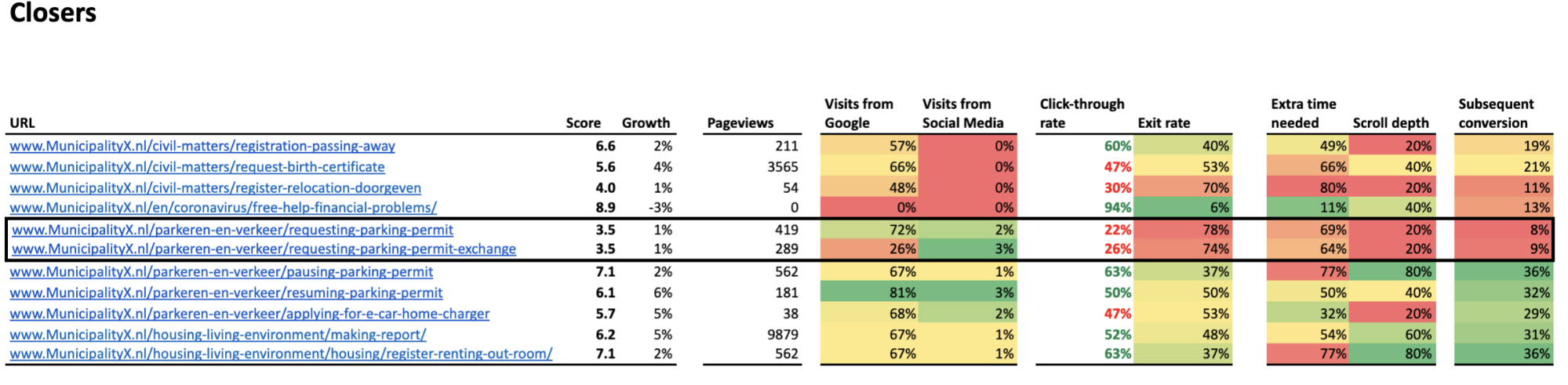
The data suggests the two most underperforming pages are the ones related to requesting a parking permit, with a low score of 3.5.
pro tip
A total page score is calculated based on every metric included in the dashboard. In the case of closers, the list includes page views, visits from Google, visits from social media, click-through rate, exit rate, extra time needed, scroll depth and subsequent conversion.
“Requesting a parking permit” page
The main cause of the low score is a click-through rate of 22%. The average visitor sees only the first 20% of the page, and 78% of them drop off. Also, the average user needs 69% of extra time (compared to the fastest user) to click on the call-to-action button. What does this tell you?
It could indicate many issues, for example:
- The call-to-action button may be placed below the fold, which makes it more difficult for visitors to find and use it. This would also explain the low click-through rate.
- The instructions on the page are hard to understand for the average resident and discourage them from taking the desired action.
Or there could be some other reasons. The FTG model points out low-performing pages but doesn’t tell you the cause. You need to investigate this issue yourself. You’ll do that by closely examining the underperforming pages of your website.
“Requesting a parking permit exchange” page
When you closely analyze the other low-performing page, the one related to requesting a parking permit exchange, you see more or less the same thing. There is one difference though: this page has also a low percent of visits from Google – 26%. This means you need to pay particular attention to e.g., keyword density or formatting of this page, to make it more attractive for search engines.
Converters
Next, let’s examine the performance of closers – the pages that are the last step in residents’ journey.
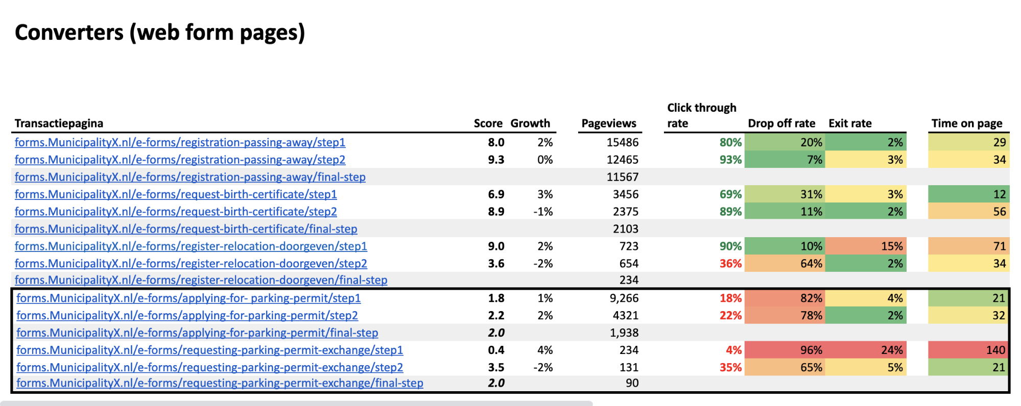
Applying for a parking permit
The dashboard shows you which pages are performing the worst. The ones related to applying for a parking permit have a low score of 2.0. This is the average score of the first (1.8) and the second step (2.2) in the web form.
The click-through rates for both steps are low – 18% between the first and second step, and 22% between the second and the third. Higher up the list, you can see much better click-through rates for different converter pages, reaching up to 93%. This makes it clear that both steps are doing poorly compared to other pages in the same category.
What may be causing these problems? It could be that:
- The introductory text is too difficult to understand
- Some functionality on this page is not working correctly – e.g., a drop-down menu or a map
There can be many reasons that explain the bad scores of particular steps in the web form. As we’ve said, the FTG model points out underperformance, but you need to perform a closer examination to test out your hypothesis.
Requesting a parking permit exchange
The other low-performing converter pages (the steps in the web form related to requesting a parking permit exchange) have the same low score of 2.0. The score of the first step is especially alarming, as it is a mere 0.4.
What’s more, in the first step you can see that many people don’t just drop out of the funnel – 24% of them leave the website completely. Finally, the average time on the page is really long in the first step compared to all steps in other web forms.
This may indicate problems such as:
- Too long or intricate instructions on how to request a parking permit exchange
- Too many fields in the form, which makes it difficult to complete
- Unclear naming of the fields in a form
- Malfunctioning of some features on the page in certain browsers (e.g., a submit button)
You need to think of all possible causes and do some further investigation. In this case, with the extremely high drop off rate of 96%, performing some user testing would be a good idea.
Summary
The FTG framework serves as a great method for detecting and examining underperforming areas of your websites, as the data is presented on user-friendly dashboards. It makes it easier to prioritize changes, since the metrics suggest which pages require your immediate attention.
Because of that, the method is gaining popularity among public organizations and their staff who want to improve digital access to services and information, but don’t have the analytical background allowing them to work on complex analytics reports.
It doesn’t serve ready-to-go answers on a platter, but it clearly points to where you should look for them.
If you’d like to learn more about the framework, be sure to follow Toon Vuursteen on LinkedIn, where he shares more information about real-life application of the model. He also gives updates on his book, “Web analytics for governments”, which is to be released in May 2022.
Finally, feel free to reach out to us if you have any questions regarding safe analytics for public institutions and governments. Our team will gladly perform a personalized demo for you.