
The designs of websites and apps often guide users and help them navigate content in a simple way. An “X” icon serves for closing documents and programs. The red color around that “X” is a warning signal that catches your attention. Cues such as this are like a secret language to make sites and software easier to use.
But what if someone applies this language to trick you into doing something you might not otherwise do? You click yes instead of no because the yes button was more prominent on the banner. Or you click continue instead of no because otherwise you would have to browse through multiple pages before reaching the content that interests you. This is what dark design patterns are in a nutshell.
And what if that yes meant that you agree to sharing personal data? Often publishers and brands use dark patterns to nudge users to share data, at the expense of data privacy.
The pervasiveness of dark patterns across web and mobile interfaces has become a concern for lawmakers. Regulations are directly addressing the problem – both the California Consumer Privacy Act (CCPA) and the General Data Protection Regulation (GDPR) create legal roadblocks for those who would use unethical dark patterns.
What are dark patterns?
The father of the term dark patterns is Harry Brignull, a UK-based user experience researcher. In 2010, the ecommerce boom revealed questionable practices using design to deceive or manipulate buyers.
Brignull noticed the trend of applying “a user interface that has been carefully crafted to trick users into doing things, such as buying insurance with their purchase or signing up for recurring bills.” However, the mechanisms behind dark patterns aren’t new. They draw on unethical, and often illegal, business practices that have been used for decades.
Dark patterns take various forms and are more than just misleading visuals. The term applies when, for instance, a site or app:
- Uses confusing language e.g., double negations
- Hides the full price of a product or service
- Omits or downplays key information
Many privacy researchers and consumer advocates have pointed out the prevalence of these dark patterns. A 2019 international study found that among the 5,000 privacy notifications analyzed from diverse companies in Europe, 54% use dark patterns and 95.8% give no choice regarding the consent or give only confirmation that data will be collected.
Although dark patterns lack a universally accepted definition, even from a legal perspective, they’ve found their place in privacy regulations. The CCPA pinpoints them as a “user interface designed or manipulated with the substantial effect of subverting or impairing user autonomy, decision-making, or choice.” We’ll return to the legal side of the problem later in the article.
Why dark patterns are so powerful
Dark patterns rely on human psychology, playing on cognitive biases that we’re often not aware of. Cognitive bias, in behavioral psychology, is a human “flaw” or “weakness” that leads people to make irrational choices.
As the Commission Nationale de l’Informatique et des Libertés (CNIL), a French data protection authority, emphasizes in its report Shaping Choices In the Digital World,
“the techniques of playing with our attention and our cognitive biases to develop manipulative and/or misleading interfaces have a direct impact on our ability to uphold our rights. We are so influenced and trained to share more and more, without always being aware, ultimately, that we are jeopardizing our rights and freedoms.”
Some companies take advantage of these cognitive biases and employ sneaky design practices to increase sales and obtain more user data. This can happen when users:
- Click accept and agree buttons to get rid of annoying banners
- Sign up to unwanted newsletter subscriptions just to move on to some service
The ways in which these design techniques nudge users can vary, which also makes them hard to spot. For instance, an app interface could require users to share contacts, location or Facebook account information in order to function, while in fact it can work just fine without that data. Or a search engine could use data-hungry default settings that benefit the provider at the expense of a user that will probably never check or change those settings.
Categories of dark patterns
Numerous consumer organizations and data protection specialists extensively research the use of dark patterns. In doing so, they’ve brought more awareness about the different forms these patterns can take.
One of the most prominent reports in the field is Deceived by design, prepared by Forbrukerrådet, a Norwegian Consumer Council. Here are the five categories they identified.
1. Default settings
Service providers usually build their digital products with privacy options. However, the default settings are almost always untouched territory for users. Research shows that 95% of people don’t change the initial settings.
The most striking example of how powerful the default setting can be comes from studies about organ donation. There are two general kinds of public policies for collecting consent: presumed consent where people agree to donation by default and explicit opt-in where people need to check an extra box to become a donor. Countries with presumed consent, organ donation as the default option, have a much higher proportion of organ donors.
The power of those default settings can also be used negatively. Many digital service providers take advantage of this and configure settings to collect as much user data as possible. This data is often then shared with third parties.
In such cases, the settings also tend to be hidden. If there is an initial option to change them, the accept button is prominent so users will continue to the service without reviewing the details of what they’re accepting.
2. Ease – how easy it is to make a choice
There are numerous methods to push users towards a certain action, making a real choice hard or impossible, for example:
- Forcing users through privacy policies or terms and conditions requiring acceptance to use the service or product
- Making certain buttons and options more visible or appealing than the others
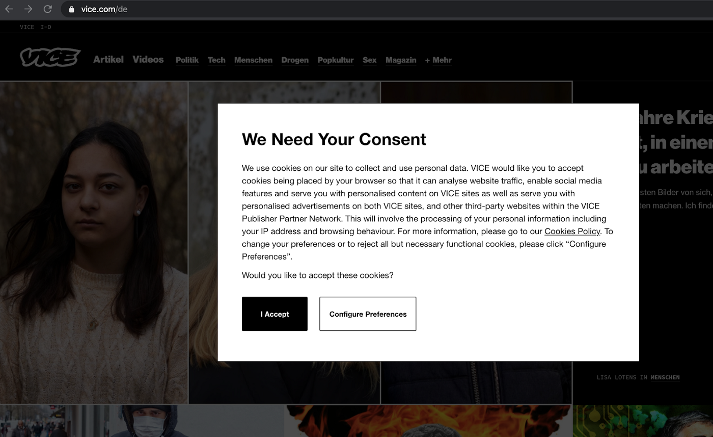
Above we have a classic example of both limiting choice and making one option more appealing. Users don’t know what to expect from a button like “Configure Preferences”, which could discourage them from clicking. They don’t know if there are any important choices to be made by configuring their preferences. The “I Accept” button is visually more appealing and also lets them quickly get access to the website.
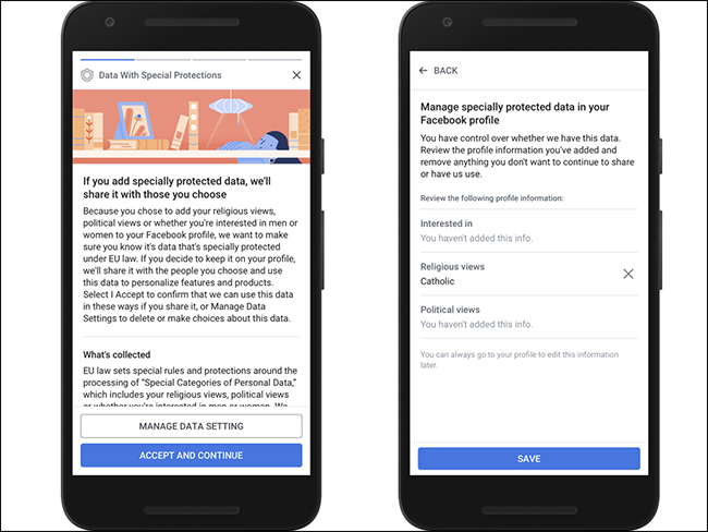
3. Framing – positive vs. negative wording
If you know or guess a user’s motivations, you can present a choice in a manipulative way – wording or framing the choice to align with the motivations of the user while also omitting key facts.
Take the launch of Facebook’s face recognition feature, for example. It alarmed many users and privacy regulators. Due to their protests, Facebook turned it off for EU citizens. Later Facebook released it with GDPR pop-ups trying to convince users that this technology is there to help protect them from bad actors and aid the visually impaired.
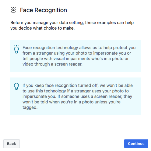
That tactic also plays on users’ fear and guilt. The statements may even be true, but they certainly aren’t the whole story of how the technology could be used.
Glossing over the negatives helps take attention away from more serious issues such as monetizing users’ personal data without explicit permission.
4. Reward and punishment
It’s possible to manipulate users with possible rewards for the “right” decisions. It’s also one of the most common persuasion techniques. The reward could be additional features, a discount or free delivery.
The opposite can also be effective. For example, some online services try to impose terms and conditions by using a “punishment”. Such is the case with well-known cookie walls that won’t allow users to enter the website without accepting tracking cookies. But that take-it-or-leave-it choice has little to do with the free, informed choices that should be available to users.
Read more about cookie walls in the Clearcode article: Walled Gardens vs Independent AdTech: The Fight for Ad Dollars and Survival
5. Forced action and timing
Pushing users to quickly complete certain actions or even limiting the time to finish them can cause users to make uninformed choices. By using the fear of missing out, manipulators can prod users into bad or risky choices, often concerning data privacy or security on the web.
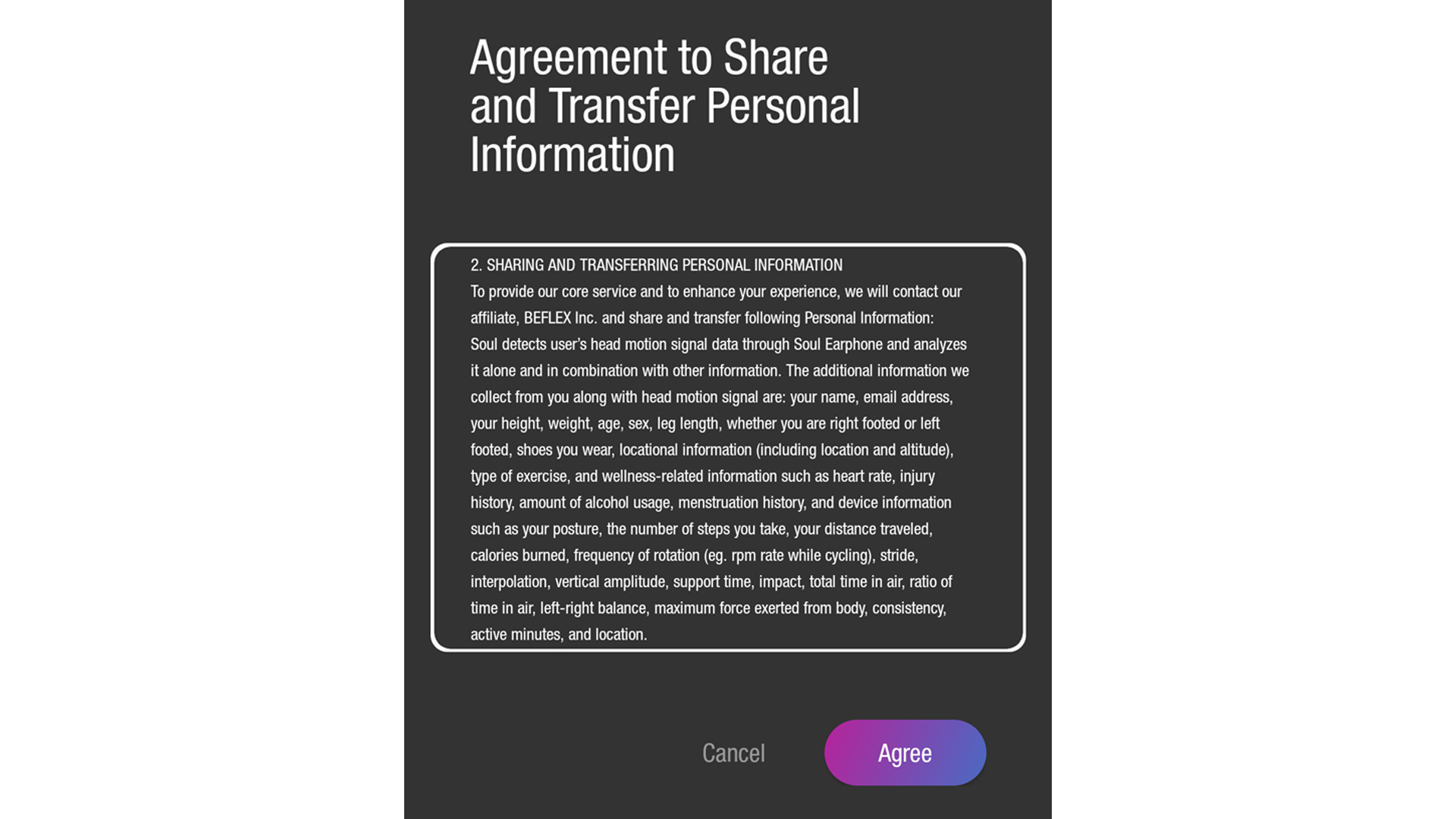
Forced action is often part of opaque opt-out mechanisms intended to maximize data collection and coerce users to keep using a product or service. To get a complete set of features, users must agree to terms and conditions which allow companies to share sensitive data such as location and past or current health problems.
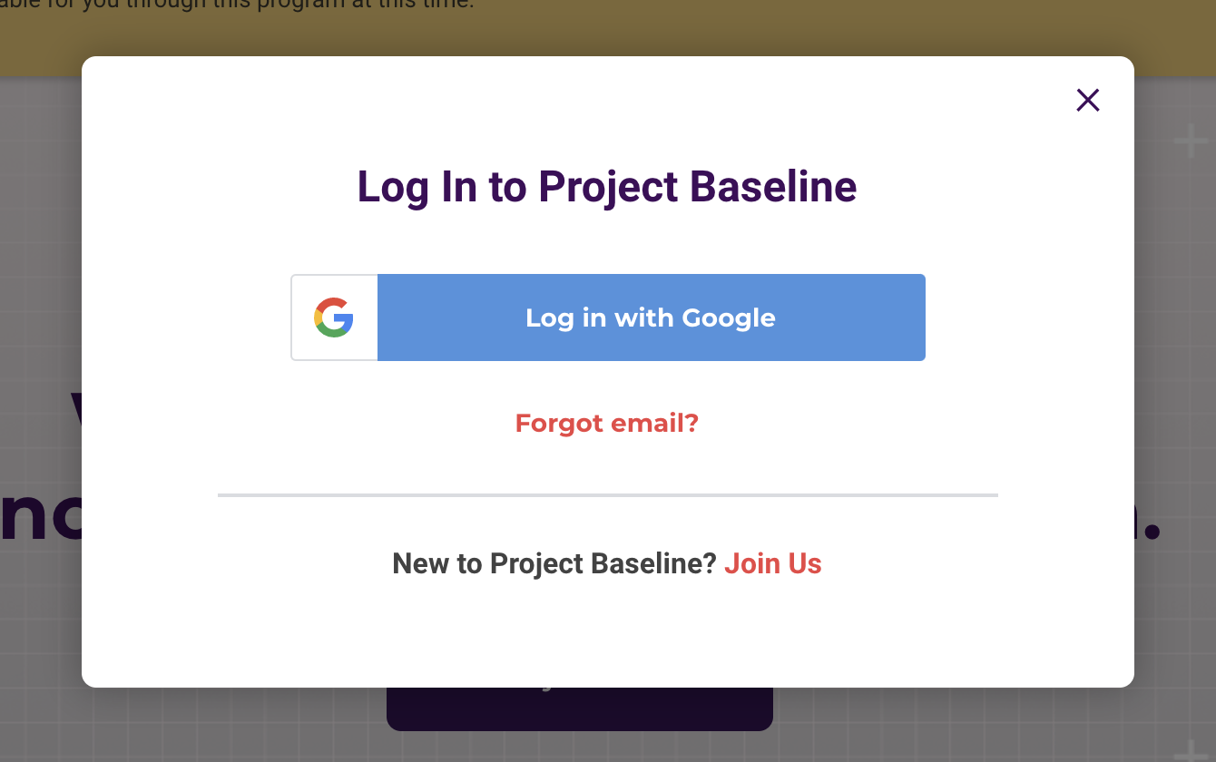
There are other questionable methods to nudge a user towards completing an action. Woodrow Hartzog, a professor and researcher focusing on privacy and data protection, talks about just such a case, Project Baseline, in a recent article. The platform, for medical research about COVID-19, encourages users to log in with an existing Google account. Worse, Project Baseline’s creator is Verily Life Sciences, a division of Alphabet. Alphabet is also Google’s parent company. Most people probably don’t want sensitive health data associated with their Google account, but that’s what they’re being nudged towards in this case.
Dark patterns v. legal frameworks
General Data Protection Regulation (GDPR)
Manipulative design practices often affect user privacy, which means they conflict with data privacy laws. The GDPR, for example, is one of the most stringent laws created to protect personal data.
Dark patterns challenge the very concept of consent as defined by the GDPR, that is:
“Any freely given, specific, informed and unambiguous indication of the data subject’s wishes by which he or she, by a statement or by a clear affirmative action, signifies agreement to the processing of personal data relating to him or her”
Consideration 32 also states that “Silence, pre-ticked boxes or inactivity should not therefore constitute consent.”
However, users often can’t freely choose to consent or not to consent, and instead have to deal with pre-checked options.
According to the report Do cookie banners respect my choice, which analyzed cookie banner design, “on a subset of 560 websites (from countries whose language the authors speak), we find that 236 (47%) websites nudge the users towards acceptance by pre-selecting options, while 38 (7%) websites do not provide any means to refuse consent.”
Another study confirmed that “dark patterns and implied consent are ubiquitous; only 11.8% meet the minimal requirements that we set based on European law.”
The Court of Justice of the European Union and regulators also stress the importance of freely given consent. That’s why implicit consent, such as when visitors continue to browse through a website without giving consent, isn’t valid.
The most common examples of dark patterns violating the consent rules are:
- Pre-selected choices
- Consent forms and notices without a “reject all” option
- Requiring more effort to reject data processing than to agree to it (e.g., forcing users to go through multiple pages of privacy policies or terms and conditions)
Read more about the nature of consent in this article: How consent manager can help you obtain GDPR-compliant consents from your users
The GDPR also suggests adopting technical and organizational measures to ensure that data protection principles are guarded from the beginning of product development.
Read more about the privacy by design in this article: Privacy by design under the GDPR
California Consumer Privacy Act (CCPA)
The CCPA requires businesses to reveal the what, why, and how of processing users’ personal information. It also allows California residents to forbid companies to sell their data.
Read more about the Californian law in this article: California Consumer Privacy Act and marketers: 5 actionable steps to follow
The request to opt out of selling that data, and the rules around it, became the main topic of an exploratory research project from scientists at Stanford University in the spring of 2020.
The research group analyzed the CCPA notices related to Do Not Sell requirements that businesses were employing. The group reported numerous cases of dark patterns that posed serious obstacles to users exercising their rights.
First, users were directed from the Do Not Sell link on a company’s homepage to the privacy policy page, where they were forced to go through the whole policy just to get to the Do Not Sell form. Then, users had to select a button or toggle on a page to send the request.
The processes lacked precise instructions, so it was unclear which exact option users should choose. The Do Not Sell forms also asked visitors to provide personal data that was unnecessary to complete the Do Not Sell request.
Researchers also noticed the use of “confusing (e.g., double negatives) or manipulative language (e.g., emotionally charged or guilt-inducing) that attempts to persuade users not to exercise their rights”.
The Stanford research results are echoed in another study “California Consumer Protection Act: Are Consumers’ Digital Rights Protected,” which Consumer Reports conducted.
According to that paper, users ran into the following problems:
- Hard-to-find links to Do Not Sell requests
- Confusing and intimidating disclosures to opt out
- Completing the request took over an hour
How compliant design patterns are good business
The world is moving towards stronger protection of consumer data. The introduction of GDPR and CCPA, along with similar regulations all over the world confirm that trend.
In a few years consumers will, hopefully, be more likely to trust companies on the internet. This would be a big change from the current situation where most of us install as much ad- and cookie-blocking software as possible.
Avoiding dark design patterns and using trusted data collection techniques is more than just a best practice or a nice thing to do – it’s good business. All the data collected with less-than-honest methods has led us to a bad spot, what some are calling the subprime data crisis. By moving away from such methods, we can get better data for the organizations where we work and also make the whole internet data ecosystem a more truthful place.
But enough of that nice stuff. Privacy regulators are also already issuing judgments and imposed penalties regarding the use of dark patterns. So avoiding fines and the reputational damage that comes with them is another obvious benefit.
What’s more, making your consent and Do Not Sell requests compliant is easier than it seems. Here are some practical steps that will help you evaluate and improve them:
- Provide options to opt in and to opt out, with no pre-ticked boxes
- Help users understand how they can manage their data and collection settings
- Inform users of all purposes for collecting their data
- Make opting out as easy as opting in
- Ensure that your request form is:
- easy to understand
- concise
- separate from other terms and conditions
- presented in plain language
- Allow users to change their mind at any time
- Allow users to make free and informed choices (don’t put pressure with how you word or present the options)
Read more about getting a valid consent under the GDPR in these articles:
* The CJEU sheds more light on trackers and consent requirements
* How to obtain consent and collect data under CNIL guidance and GDPR
Avoiding dark patterns is about clear communication and speaking the language users already know and understand. Red X’s close windows, green buttons say yes and orange text serves as a warning. In our experience, the best businesses are those that clearly and honestly communicate a solid value proposition. So we’d even go as far as to say that honest design, without dark patterns, is a competitive advantage.
If you’d like to discuss dark patterns further and learn more about how to collect consent in a privacy-compliant way, get in touch.