
User onboarding – one of the most crucial steps in the user journey across a digital product or app. Many marketers believe that the key to this process is to make new users sign up for a free trial, open an account or download an app. If you share this belief, then you could be terribly wrong.
Multiple studies show that among people who sign up for a free product trial, 40-60% use it only one time. Moreover, as many as 80% of new users forget about the app three days after downloading it.
But there are ways to avoid such a grim fate and help your product pass the user test, getting users to stick with it. The critical milestones in the user journey are user onboarding and activation. This is the moment when users decide to keep your product or app for good or rather give up after the first try. But what exactly is user onboarding, and what do you need to know about it? Let’s find out!
Step 1. Get the gist of user onboarding
First of all, there’s no universal definition of user onboarding, because it’s a complex and fluid process that varies from organization to organization. No matter how you define it, onboarding should be a requisite step before you convert your prospect into a customer.
User onboarding is the process of increasing the likelihood that new users become successful when adopting your product.
Samuel Hulick
UserOnboard.com
It’s crucial to show people the new value your product offers them and then encourage them to move forward in their customer lifecycle. However, this procedure involves multiple channels. It takes delivering the right content at the right time so users learn how to maximize their use of your app.
Moreover, guiding users to where they can find value in your product is bringing them to what is called the “AHA Moment”. It means that even a single feature can make a user grasp your product’s core value and inspire them to use it more and more. Onboarding is also about giving users all the reasons “why” they need the product and helping them discover how it impacts their life.
No wonder product teams optimize the user flow through the onboarding process. This usually requires collecting tons of qualitative and quantitative data to capture necessary insights about the user journey.
Qualitative data includes a customer’s voice, video recording of user interactions, users testing or surveys. On the other hand, quantitative data mainly covers the user journey captured via web analytics or product analytics tools. Today we will focus solely on the quantitative part.
However, you must understand that not every web analytics tool is suitable for such analysis. That’s because onboarding optimization involves secure member areas of your website. Depending on the industry or field you operate in, this could be where users schedule appointments, review their medical records, buy new products or perform financial transactions.
In other words, post-login areas contain a wealth of personal data, including sensitive information. So if you want to use this data, make certain that the software you employ for the job guarantees top-level security. It must protect data from any spillage or breach. You don’t want to put either your customers or your company’s reputation at risk.
If you’re curious about details on tracking post-login areas, check out Piwik PRO’s case study:
How to Capture the Whole Customer Journey When Dealing With Secure Member Areas
Step 2. Better understand user onboarding flow in WordPress
One of the most popular digital products with a secure member area is WordPress. To be precise, we’re talking about its admin panel with a cockpit for managing all the content, design and features deployed on the website.
Navigating around the panel of a typical self-hosted WordPress website is a great example of user onboarding flow. We want to show you what the whole process looks like step-by-step so you get the big picture. We’ll walk you from the first steps when the user gets familiar with the basic setup to the moment they take their post live.
Let’s dive into this!
Stage 1. The user needs to configure basic settings for a new website. This is usually broken into three separate substeps:
- General Settings
- Writing
- Reading
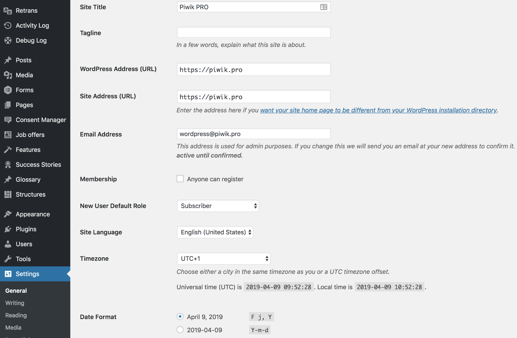
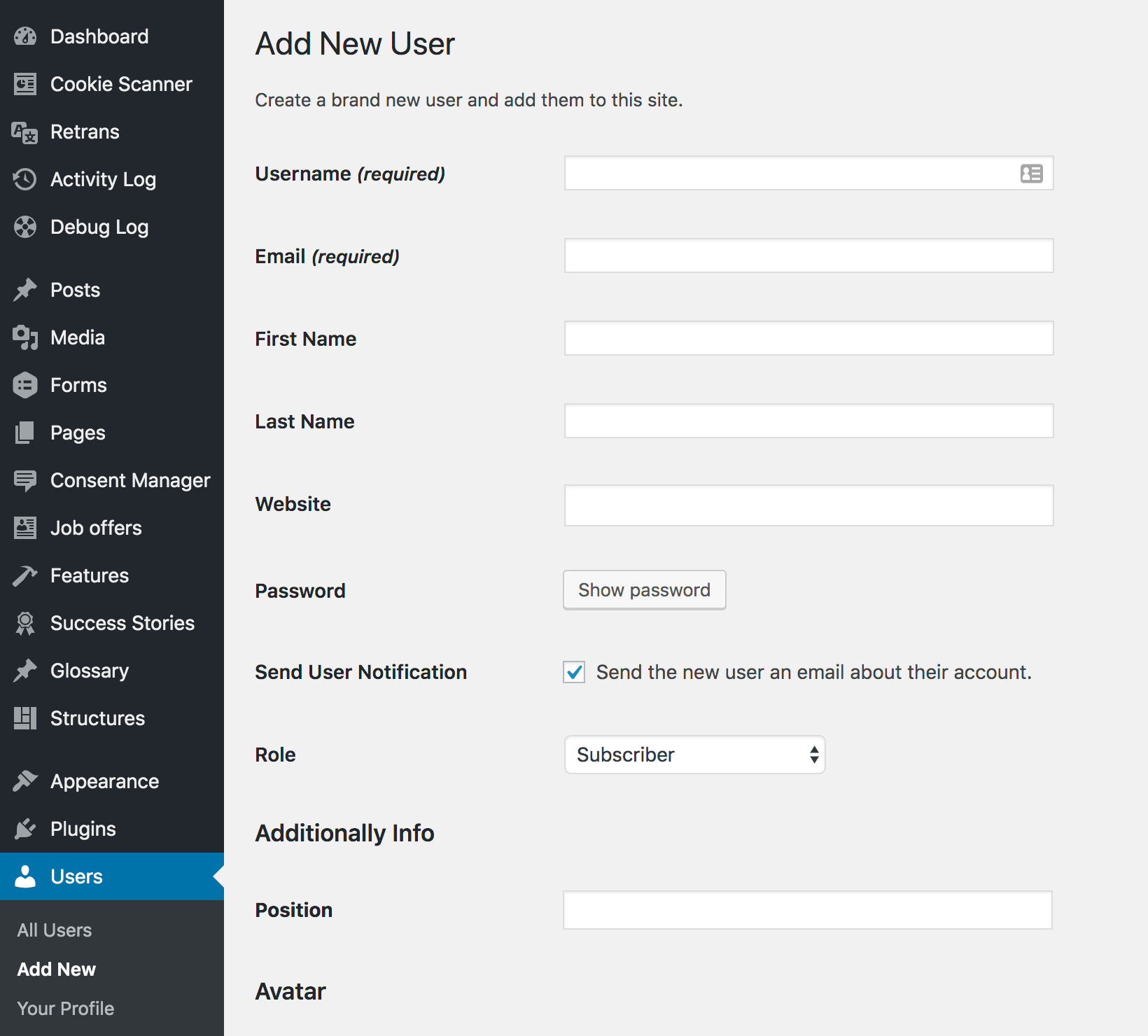
Stage 2. Configure user settings – this can also be divided in the following substeps:
- Filling out user profiles with authors bio, profile pictures and social media links
- Adding new users & authors
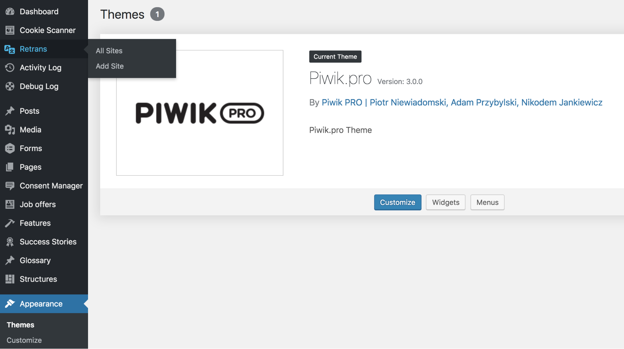
Stage 3. Digging a bit deeper. Now you need to set up a theme by using a template and then install everything on your website. You can take a free template from the WordPress library or a premium product from third-party providers.
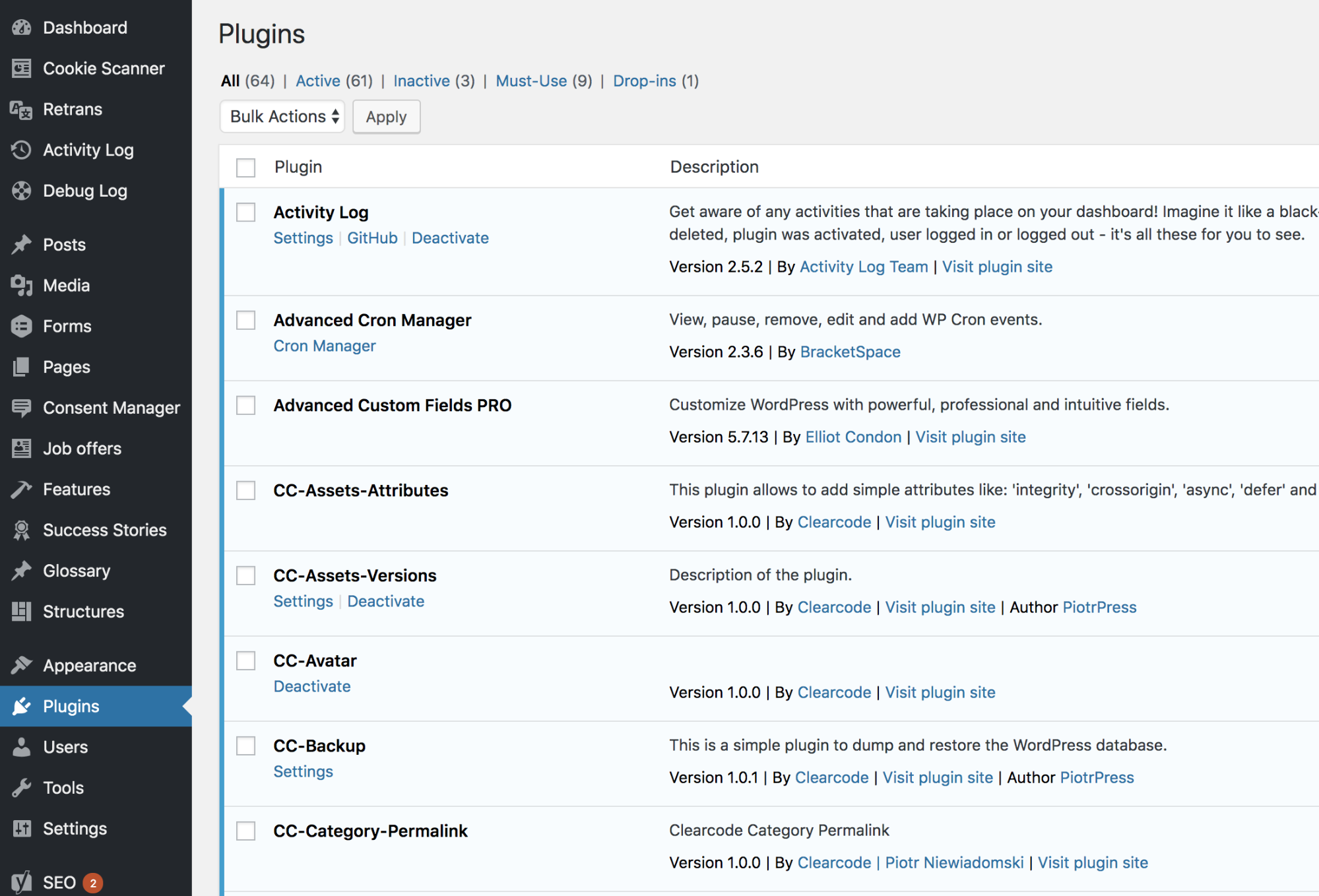
Stage 4. Installing plugins. You can choose from:
- Security plugins
- SEO plugins
- Social media plugins
Of course, you can also add any other extensions that you want on your website.
Stage 5. Publishing the first piece of content. It can be a blog post or a website. That step marks the end of the initial onboarding process.
The last step is a sort of closure for the user’s onboarding in WordPress. It represents the so called AHA Moment for new users. Now they have discovered the core value of this digital product, that is the ease and speed of publishing, editing and formatting a new post or page online.
The value is also represented by the ability to optimize the page for SEO purposes and for sharing it across social media channels.
Note! User flow is a complex and tricky matter. If you want a little background and to learn how to maximize it, read our post: 3 Reports for Optimizing User Flow on Your Website
Step 3. Move from stages to events in the WordPress user onboarding process
Mapping all key product features and interactions to events is a vital part of capturing the whole user journey within your product. But before you go further with the details of this process there’s one more point to consider, namely a tracking plan.
COMPARISON
The comparison of 10 web and app analytics platforms
Learn the key differences between Piwik PRO Enterprise, Google Analytics 4, Matomo Cloud, Adobe Analytics, AT Internet, Countly Enterprise, Mixpanel Enterprise, Amplitude Enterprise, Snowplow Enterprise, and Heap Premier.
1. Make a tracking plan the foundation for events tracking
Whether you’re planning the onboarding process for your product or for a website, you need to make sure you focus on the right goal. That requires having a framework, knowing what types of data and what events you need to track and what properties are important, but also what makes them crucial from the business standpoint.
You can use a spreadsheet or any other form you find handy – the key is to have everything in one place. A tracking plan structures your work and lets you adjust your strategy along the way, as you might introduce some changes from time to time.
It’s crucial to present your business goals, the objective you want to achieve with your product. You plan must also contain the analytics questions that you want to answer with tracking. This will help prevent you from making critical errors.
What’s more, for product analytics it’s best to split the document into the following sections:
- Name of product section
- Name of funnel
- Name of event
- Conditions for firing an event
- Event properties and values
- Additional notes
Finally, this document gives you better control over your actions. Make sure everyone engaged in the process gets a copy so nobody misses even the smallest bit of your strategy.
If you need more guidance on creating your tracking plan, have a look at our post:
Analytics Implementation in 12 Steps: An Exhaustive Guide (Tracking Plan Included!)
2. Map product features and interaction to events with Piwik PRO
Once your tracking plan is ready, you can put it into action. You have to map how users interact with your product – clicking on things, changing settings, publishing content, etc. – into a form that analytics platforms can turn into useful data. These are events.
This allows you to capture the customer journey through your product in analytics data and take concrete action.
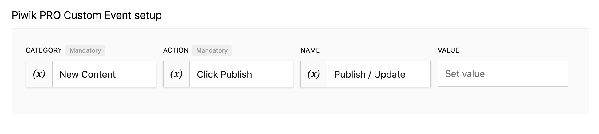
Here’s a short explanation of what this looks like in practice. Mapping events means that you take a user action, such as setting a theme in WordPress settings, and you turn it into an event in Piwik PRO, which records user type, current page, previous action, next action, etc. Events needs to be configured using Piwik PRO Tag Manager.
To successfully track users’ journeys and their flow, you can set up the following “events” and “virtual page views”:
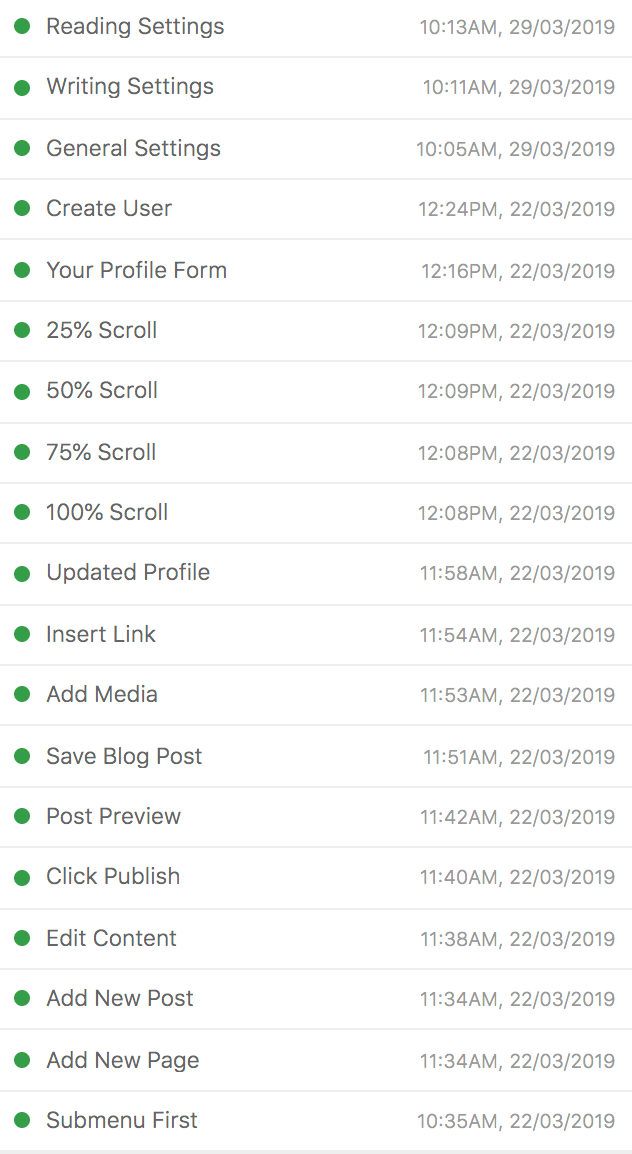
- Events & virtual page views for form handling. They are fired whenever a user fills out or edits one of the setup forms: General Settings, Writing Settings, Reading Settings, User Profile, Add New User.
- User interactions. They are activated when a user:
- saves, publishes or previews a new piece of content (a blog post or page)
- edits and publishes a new piece of content
- adds a new interactive piece of media to a blog post
- adds, links or uses other formatting options in WordPress visual editor.
- Additional interactions. This could be just scroll depth on each WordPress screen or clicking individual items in the WordPress settings menu
Now you’ve got the bigger picture, let’s have a look at the example of Event setup for a user interaction, precisely publishing/updating a new piece of content in WordPress:
To help you out, below we’ve given a complete list of configured events and virtual page views for each user interaction mapped to a user journey during onboarding.
Careful! Configuring all these events for your product analytics strategy requires the right software. Right means secure and one that won’t put any data at risk. With a privacy friendly tag manager, like Piwik PRO, you can fire tags across secure member areas and be sure that no information is shared with third parties and nobody gets unauthorized access.
Also, it provides hassle-free deployment with easy-to-navigate management. Ale lets you effortlessly set custom events with minimal technical know-how.
Once all user actions in WordPress have been transformed into events and properly tagged, it’s time to monitor how users flow through the onboarding process.
Piwik PRO offers a number of tracking methods that you can combine for even better insights.
Step 4. Paint a picture with your onboarding data
Having a wealth of data at your fingertips is meaningless if you can’t present the data in the right way. It must tell a complete story. Fortunately, you have numerous methods for efficiently reporting and visualizing the whole user flow throughout the onboarding process.
To spare you some time and effort, here’s a checklist:
- Create funnel visualization reports
- Apply user flow reports by means of flow visualizations or custom reports
- Export the segmented data to an external spreadsheet (Excel or Google) and prepare your own visualizations and dashboards
- Export raw data into external visualization tools like Power BI or Looker Studio
We’ve picked a couple of reporting and visualization methods to discuss.
1. Visualize the onboarding process with funnels
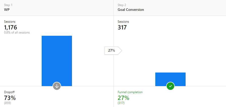
It’s relatively easy to visualize your onboarding flow using funnels, if your onboarding is linear. This means there is a separate URL address for each screen and step.
Let’s have a look at one of the simple funnels created with Piwik PRO, when a user downloads a lead magnet:
Things get tricky when your app or product involves different interactions that can be captured only by event tracking. Here virtual page views come in handy as they allow you to construct a funnel composed of events and user actions.
But what do we mean by virtual page views? In a nutshell, it’s tracking a physically nonexistent URL which is used only for reporting. Whether it’s a popup, button click, or any other action which doesn’t cause a page reload or when a page has the same URL, you can still track it. You just need to attach a virtual page view to the event of your choice.
If you want to know all the juicy details of setting up virtual page views and then using them in building conversion funnels, check out our previous posts:
Ok, you’ve set up virtual page views for each step of the WordPress onboarding process. Now you can build a funnel visualization that covers all steps we’ve discussed.
The benefits of all this work are insights that help you discover:
- which steps of the onboarding process get the most / the least page views
- if users get stuck on the most viewed steps
- if users reach the least viewed steps despite struggles on the previous steps
- if users are moving in a predicted order or not
- if there are steps where the product fails to deliver its promise
However, such a basic report might not be enough to answer all these questions. Don’t fret, we’ve got you covered with another method.
2. Turn Google & Excel Spreadsheets into effective onboarding visualization
When a simple report is not enough, you should reach for a tailored one. To make one, start with using a spreadsheet like Google or Excel. This gives you lots of flexibility to visualize data, as well as to apply ad hoc changes and questions.
- Build a separate segment in Piwik PRO web analytics for every step of the onboarding. For instance, one segment for all users who reached the fourth stage in the process.
- Put all segments representing the onboarding flow into a table – each step in a separate column.
- Once all segments are in the spreadsheet, experiment, play around and find the most efficient way to visualize the flow.
We’ve used this method to successfully build what are called “behavioral & horizontal funnels”. This is a handy thing you can apply to your onboarding process.
We’ve covered the whole process in detail, so check out our post: Funnels Based on Behavioral Segmentation: a Little-Known Way to Map the Entire Customer Journey.
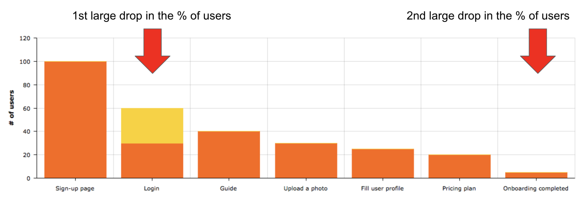
Now, let’s see one of the most effective ways of visualizing the onboarding flow, a “bar chart funnel”. Here is what this flow looks like for an Online Dating App / Online Dating Website.
Additionally, you can get even deeper insights and answer more analytics questions when you further segment your funnel.
Below is an example of using additional layers of segmentation when building our behavioral funnels:
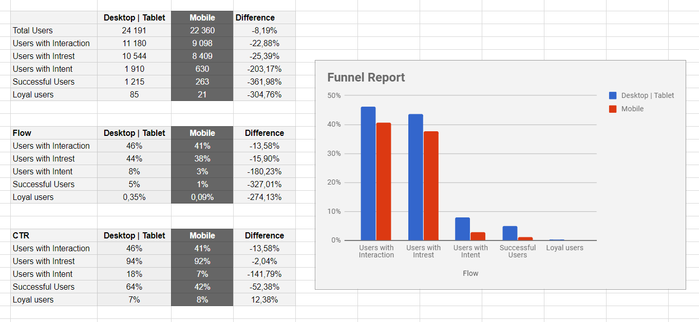
The ins and outs of this custom report are covered in the post mentioned above.
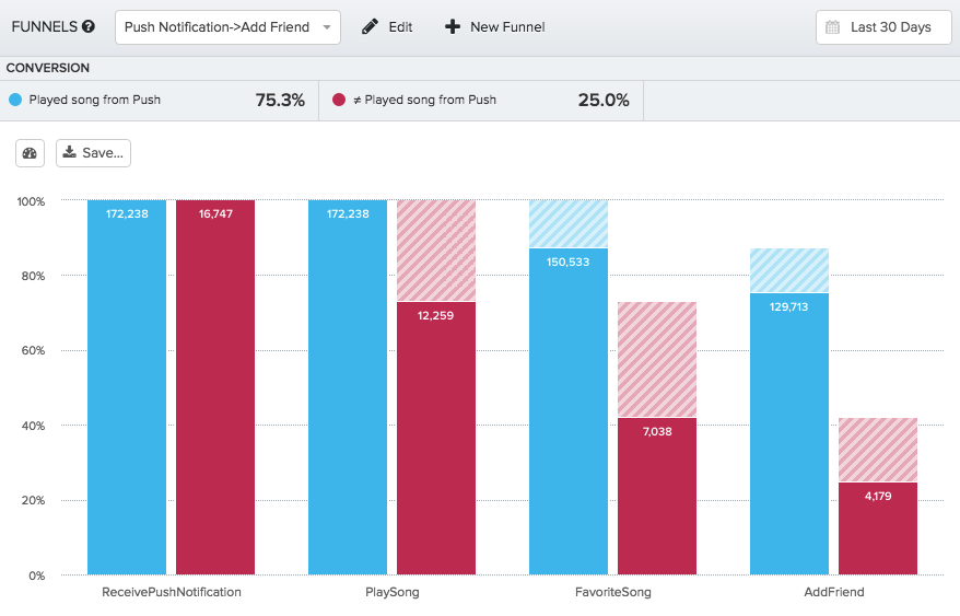
Last but certainly not least, a powerful report from Mixpanels’ home base, bar chart funnels in concert with additional layers of segmentation, all for a music app like Spotify. Have a look:
If you’re wondering precisely what insights and answers you’ll get from this reporting method, here’s a list:
- Conclusions and lessons learned from using regular funnel reports
- Which user segments have the most and the least success with your onboarding process
- Which user segments see the most value in your product
- Which users you need your product to be more attractive to
Final thoughts
Successful tracking of users as they take their first steps around your digital product is a complex process. Above all, it takes effective reporting methods, consistent application of a tracking plan, the right analytics software and lots of time.
Hopefully with this article we’ve managed to make your job a bit easier. We know there’s a lot more to say, so stay tuned for more articles. And if you’ve got some questions now, just drop us a line and we’ll be glad to help you out.