Understanding actual visitor behavior on your website allows you to adjust content, layout, and placement of your call-to-action (CTA) buttons strategically. This improves user experience and drives conversion by making the natural paths smoother rather than forcing users into unnatural flows.
Patterns to watch for:
- Users consistently skipping pages you thought were important (suggesting those pages add friction, not value)
- Unexpected entry points that lead to high conversion rates (indicating opportunities to optimize those paths)
- Pages where users repeatedly loop back instead of progressing forward (signaling confusion or missing information)
- Alternative paths to conversion that work better than your primary funnel
Common analysis mistakes
The most common mistake is assuming that the most common path is the best path. Sometimes the most traveled route is simply the most obvious one, but alternative paths might convert better or serve different user segments with different needs.
Another error: looking at click paths without segmenting by user type, traffic source, or device. Mobile users follow completely different navigation patterns than desktop users. First-time visitors behave differently than returning customers. Blending all this together obscures the insights.
An example of click path:
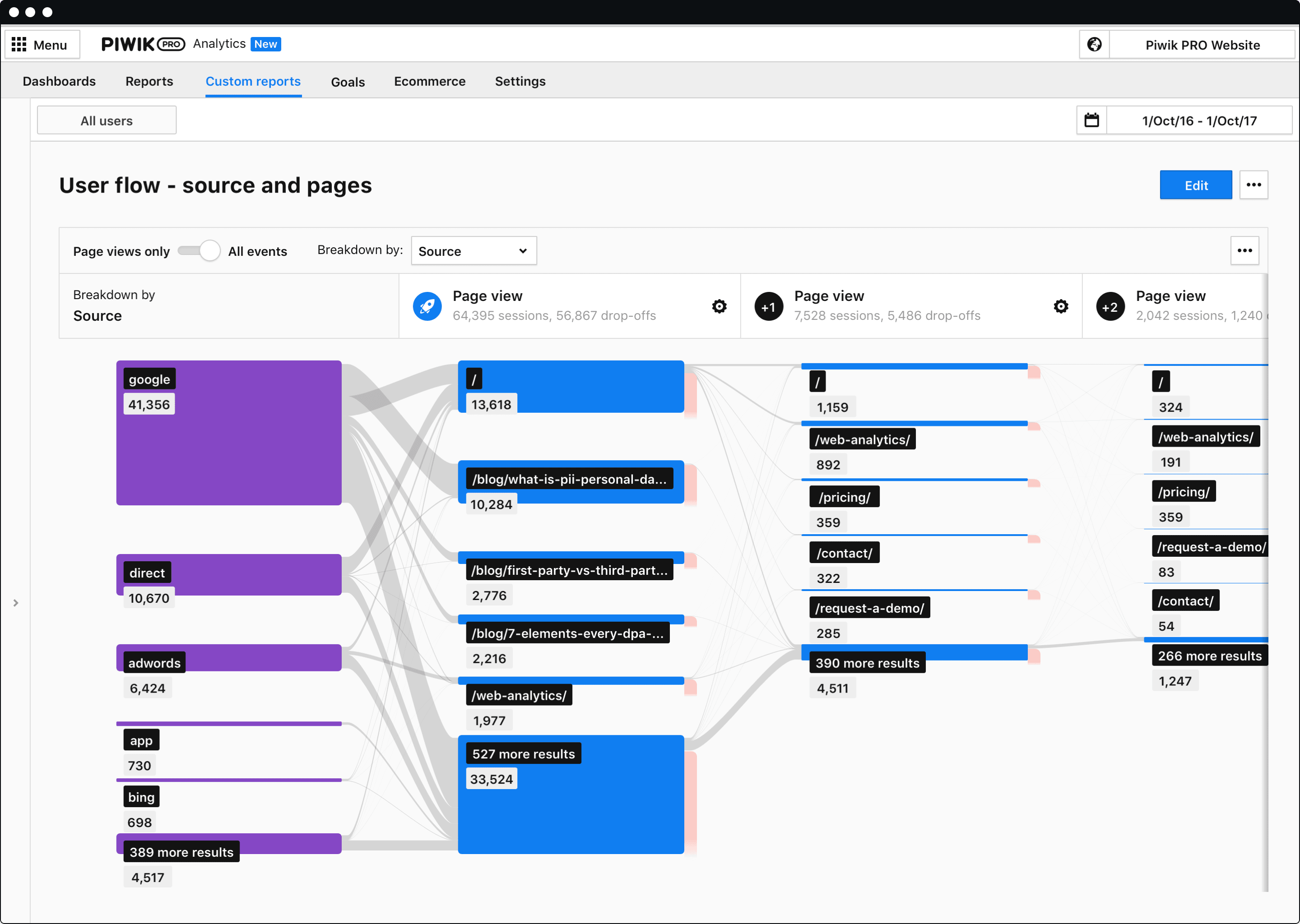
More about click path and user flow on the Piwik PRO blog:
- Data flow in an analytics platform: How to set up your data collection and analysis process
- 3 reports for optimizing user flow on your website
- 4 steps to apply product analytics to track user onboarding
For more technical aspects of the user flow, read Piwik PRO help center articles: